Custom CSS Snippets
Table of Contents
- Scenes
- Fit more thumbnails on each row
- Allow for longer string when displaying “Studio as Text” on scene thumbnails
- Hide scene specs (resolution, duration) from scene card
- Hide studio logo/text from scene card
- Make the list of tags take up less width
- Swap studio and resolution/duration positions
- Adjust the mouse over behaviour in wall mode
- Disable zoom on hover in wall mode
- Hide the scene scrubber
- Hide the truncated text
- Images
- Movies
- Galleries
- Performers
- Show entire performer image in performer card
- Show a larger image in performer’s page for desktop
- Place performer image in the background on performer page
- Show larger performer images in performers list
- Move the buttons in the Performer’s edit panel to the top instead of bottom
- Move the tags row in the Performer’s edit panel to the second position (just after name)
- Studios
- Tags
- Global
Custom CSS allows you to modify Stash’s stock style sheets.
The following is a list of some useful CSS snippets. You may use them by copying-and-pasting them into the Custom CSS editor found in the Settings > Interface Configuration panel or by navigating to localhost:9999/settings?tab=interface
Note: Future releases of Stash may break these CSS tweaks. CSS tweaks may not appear without flushing the Stash browser cache first on Chrome.
Scenes
Fit more thumbnails on each row
| Description | Reduce left and right padding on Scene and Performer grid pages allowing for more thumbnails on each row. |
| Author | |
| Screenshots |  |
/* [Scenes tab] Fit more thumbnails on each row */

.grid { padding: 0px !important; }
Allow for longer string when displaying “Studio as Text” on scene thumbnails
| Description | Allow for longer string when displaying “Studio as Text” on scene thumbnails. |
| Author | |
| Screenshots | |
/* [Scenes tab] Allow for longer string when displaying "Studio as Text" on scene thumbnails */

.scene-studio-overlay {
	font-weight: 600 !important;
	opacity: 1 !important;
	width: 60% !important;
	text-overflow: ellipsis !important;
}
Hide scene specs (resolution, duration) from scene card
| Description | Hide scene specs (resolution, duration) from scene card. |
| Author | |
| Screenshots | |
/* [Scenes tab] Hide scene specs (resolution, duration) from scene card */

.scene-specs-overlay {
  display: none;
}
Hide studio logo/text from scene card
| Description | Hide studio logo/text from scene card. |
| Author | |
| Screenshots | |
/* [Scenes tab] Hide studio logo/text from scene card */

.scene-studio-overlay {
  display: none;
}
Make the list of tags take up less width
| Description | Make the list of tags take up less width. |
| Author | |
| Screenshots | |
/* [Scenes tab] Make the list of tags take up less width */

.bs-popover-bottom {
  max-width: 500px
}
Swap studio and resolution/duration positions
| Description | Swap studio and resolution/duration positions. |
| Author | |
| Screenshots | |
/* [Scenes tab] Swap studio and resolution/duration positions */

.scene-studio-overlay {
  bottom: 1rem;
  right: 0.7rem;
  height: inherit;
  top: inherit;
}

.scene-specs-overlay {
  right: 0.7rem;
  top: 0.7rem;
  bottom: inherit;
}
Adjust the mouse over behaviour in wall mode
| Description | Adjust the mouse over behaviour in wall mode. |
| Author | |
| Screenshots | |
/* [Scenes tab] Adjust the mouse over behaviour in wall mode */

@media (min-width: 576px) {
 .wall-item:hover::before {
   opacity: 0;
 }

 .wall-item:hover .wall-item-container {
   transform: scale(1.5);
 }
}
Disable zoom on hover in wall mode
| Description | Disable zoom on hover in wall mode. |
| Author | |
| Screenshots | |
/* [Scenes tab] Disable zoom on hover in wall mode */

.wall-item:hover .wall-item-container {
    transform: none;
}
.wall-item:before {
    opacity: 0 !important;
}
Hide the scene scrubber
| Description | This will hide the large scene scrubber under the video player and max out the player’s height. |
| Author | |
| Screenshots | 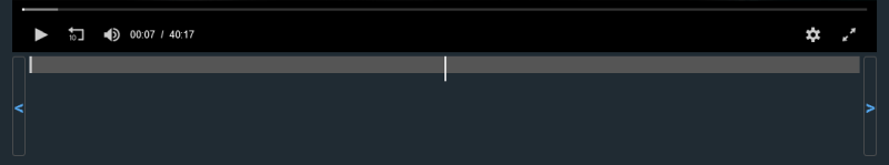 |
/* [Scenes tab] Hide the scene scrubber and max out the player's height */
.scrubber-wrapper {
  display: none;
}
Hide the truncated text
| Description | This will hide the truncated text that appears under the tile and date. |
| Author | |
| Screenshots | |
/* [Scenes Tab] - Hide the truncated text on scene card */

.TruncatedText.scene-card__description {
   display: none;
}
Images
Disable lightbox animation
| Description | Disable lightbox animation. |
| Author | |
| Screenshots | |
/* [Images tab] Disable lightbox animation */

.Lightbox-carousel {
  transition: none;
}
Don’t crop preview thumbnails
| Description | Don’t crop preview thumbnails. |
| Author | |
| Screenshots | |
/* [Images tab] Don't crop preview thumbnails */

.flexbin > * > img {
  object-fit: inherit;
  max-width: none;
  min-width: initial;
}
Movies
Better Movie layout for desktops, regular size poster
| Description | Making the front and back image much bigger. Left panel uses 70% while the right uses 30%. |
| Author | |
| Screenshots | |
/* [Movies tab] Better Movie layout for desktops: Regular size poster */

.movie-details.mb-3.col.col-xl-4.col-lg-6 {
  flex-basis: 70%
}
.col-xl-8.col-lg-6{
  flex-basis: 30%
}
.movie-images{
  flex-wrap: wrap
}
.movie-image-container {
  flex: 0 0 500px
}
Better Movie layout for desktops, larger size poster
| Description | Making the front and back image much bigger. Left panel uses 70% while the right uses 30%. |
| Author | |
| Screenshots | |
/* [Movies tab] Better Movie layout for desktops: Larger size poster */

.movie-details.mb-3.col.col-xl-4.col-lg-6 {
  flex-basis: 70%
}
.col-xl-8.col-lg-6{
  flex-basis: 30%
}
.movie-images{
  flex-direction: column;
  flex-wrap: wrap
}
.movie-image-container {
  flex: 1 1 700px
}
Galleries
Grid view for galleries
| Description | Grid view for galleries. |
| Author | |
| Screenshots | |
/* [Galleries tab] Grid view for galleries */

.col.col-sm-6.mx-auto.table .d-none.d-sm-block {
    display: none !important;
}
.col.col-sm-6.mx-auto.table .w-100.w-sm-auto {
    width: 175px !important;
    background-color: rgba(0, 0, 0, .45);
    box-shadow: 0 0 2px rgba(0, 0, 0, .35);
}
.col.col-sm-6.mx-auto.table tr {
    display: inline-table;
}
Disable lightbox image transition
| Description | Disable lightbox image transition. |
| Author | echo6ix |
| Screenshots | |
/* [Gallery tab] Disable lightbox image transition */
.Lightbox-carousel {
  transition: unset;
}
Hide the lightbox header and footer
| Description | Hides the lightbox header and footer to make the image area larger. Mouse reveals them as an overlay to the image. |
| Author | peresabcod |
| Screenshots | |
/* [Gallery tab] Hides the lightbox header and footer to make the image area larger. Mouse reveals them as an overlay to the image*/

.Lightbox-header,
.Lightbox-footer{
z-index:9999;
 position:absolute;
 width:100%;
 opacity:0;
background-color:#0008;
 transition: opacity 0.5s ease;
}

.Lightbox-footer{
bottom:0;}

.Lightbox-navbutton{
opacity:0;
transition: opacity 0.5s ease;
}


.Lightbox-navbutton:hover,
.Lightbox-header:hover,
.Lightbox-footer:hover{
opacity:1;
}
Performers
Show entire performer image in performer card
| Description | Show entire performer image in performer card. |
| Author | |
| Screenshots | |
/* [Performers tab] Show entire performer image in performer card */

.performer.image {
  background-size: contain !important;
}
Show a larger image in performer’s page for desktop
| Description | Show a larger image in performer’s page for desktop. |
| Author | |
| Screenshots | |
/* [Performers tab] Show a larger image in performer's page for desktop */
.performer-image-container{
  flex: 0 0 50%;
  max-width: 50%;
}
/* Changing .col-md-8 settings also affects studios and tags display. 50% should be good enough. */
.col-md-8 {
  flex: 0 0 50%;
  max-width: 50%;
}
Place performer image in the background on performer page
| Description | Place performer image in the background on performer page. |
| Author | |
| Screenshots | |
/* [Performers tab] Place performer image in the background on performer page */

.performer-image-container.col-md-4.text-center {
    flex: 0 0 0%;
    max-width: 0%;
}

#performer-page .performer-image-container .btn.btn-link {
    position: fixed;
    width: 100%;
    top: 0;
    left: 0;
    padding: 0;
}

#performer-page .performer-image-container .btn.btn-link:before {
    content: '';
    position:absolute;
    top:0;
    left: 0;
    right: 0;
    bottom: 0;
    background: linear-gradient(to left, rgba(0,0,0,0) 0%,rgb(0 0 0 / 75%) 100%);
    z-index: 1;
}

#performer-page .performer-image-container .performer {
    max-height: none;
    max-width: none;
    width: 100%;
}
Show larger performer images in performers list
| Description | Show larger performer images in performers list. |
| Author | |
| Screenshots | |
/* [Performers tab] Show larger performer images in performers list */
/* original value: height: 30rem; min-width:13.25rem; */
.performer-card-image{
  height: 45rem;
  min-width: 20rem;
}
Move the buttons in the Performer’s edit panel to the top instead of bottom
| Description | Move the buttons in the Performer’s edit panel to the top instead of bottom (in newer version of Stash, the buttons are already positioned both at top and bottom. |
| Author | |
| Screenshots | |
/* [Performers tab] Move the buttons in the Performer's edit panel to the top instead of bottom (in newer version of Stash, the buttons are already positioned both at top and bottom.  */

form#performer-edit {
    display: flex;
    flex-direction: column;
}
#performer-edit > .row {
    order: 1;
}
#performer-edit > .row:last-child {
    order: 0;
    margin-bottom: 1rem;
}
Move the tags row in the Performer’s edit panel to the second position (just after name)
| Description | Move the tags row in the Performer’s edit panel to the second position (just after name). |
| Author | |
| Screenshots | |
/* [Performers tab] Move the tags row in the Performer's edit panel to the second position (just after name).  */

form#performer-edit {
    display: flex;
    flex-direction: column;
}
#performer-edit > .row:nth-child(24) {
    order: -1;
}
#performer-edit > .row:first-child {
    order: -2;
}
Studios
Different studio cards layout
| Description | Changes the layout of studio cards. |
| Author | Qx#1573 |
| Screenshots | 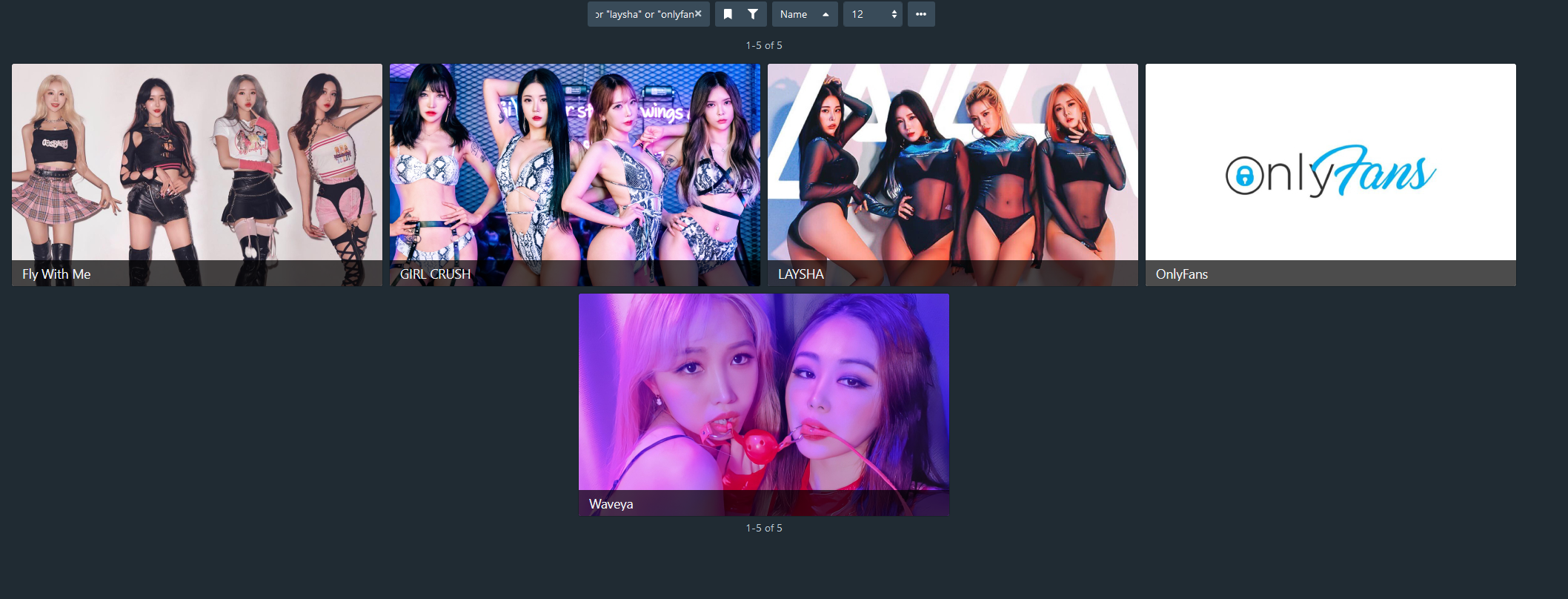 |
/* [Studios tab] Changes the layout of studio cards */
.studio-card.grid-card.card div.card-section div.rating-banner { display: none; }
.slick-slide .studio-card-image { height: 300px; }

.studio-card, .recommendation-row .studio-card {
    padding: 0;
    width: 500px;
    height: 300px;
}

.studio-card-image, .recommendation-row .studio-card .studio-card-image {
    max-height: 300px;
    width: 500px;
}

.studio-card.grid-card.card div.card-section {
    position: absolute;
    bottom: 0em;
    width: inherit;
    background-color: rgba(0, 0, 0, 0.7);
    overflow: hidden;
    height: 2.5em;
    transition: 0.5s ease-in-out;
}

.studio-card.grid-card.card div.card-section:hover {
    height: 7em;
}
More studio per row
| Description | Display more studio per row |
| Author | hijack_hornet |
| Screenshots | 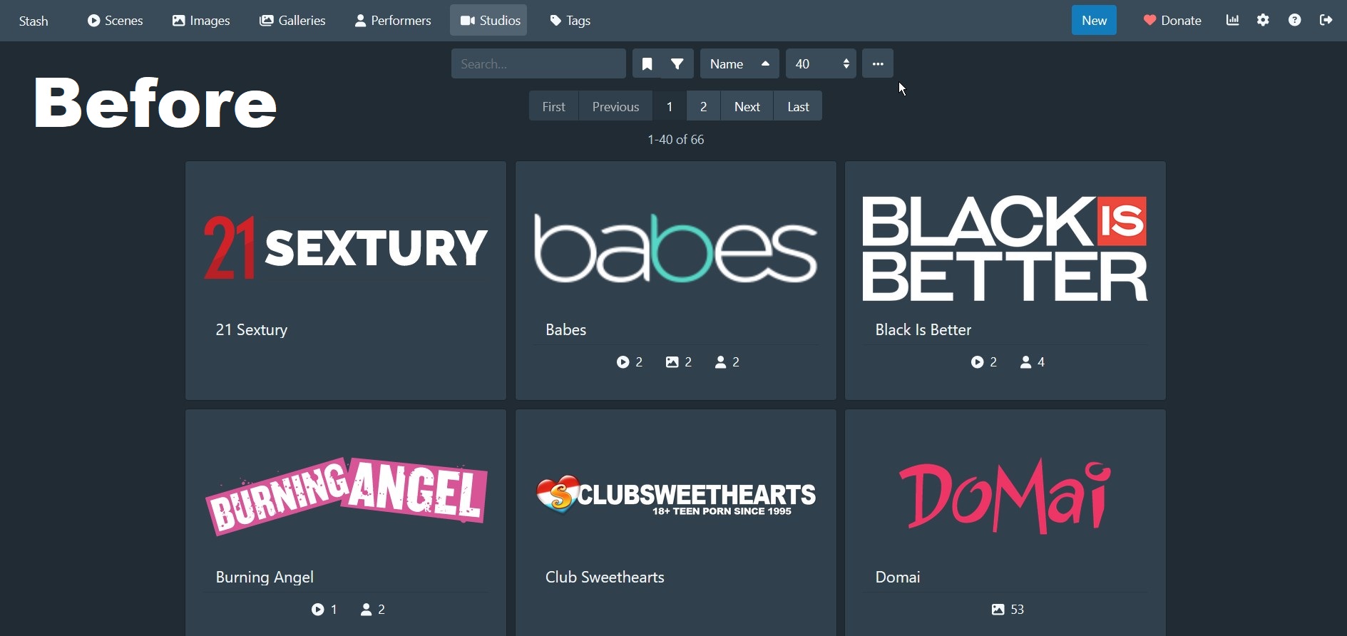 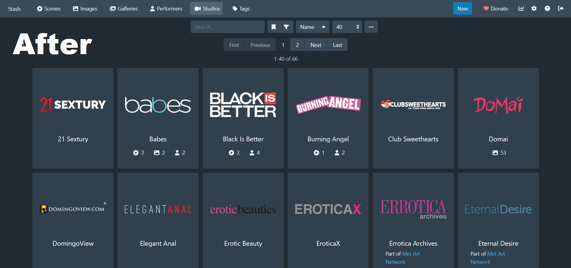 |
/* [Studios tab] Show more item per row */
:not(.recommendation-row .studio-card).studio-card {
    width: 15%
}
:not(.recommendation-row .studio-card-image).studio-card-image {
    width: 100%
}
.studio-card h5 {
    text-align: center !important;
    display: block;
}
Tags
Different tag cards layout
| Description | Changes the layout of tag cards on tags tab and when hovering on tags in different content. |
| Author | Qx#1573 |
| Screenshots | 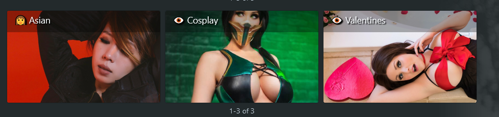 |
/* [Tags changes] changes the layout of tag cards on tags page and hover */
.tag-parent-tags, .tag-sub-tags { display: none;}
.tag-card.zoom-0.grid-card.card div.card-section div.card-popovers.btn-group { margin-top: 1em; }
.tag-card.zoom-0.grid-card.card div.thumbnail-section a.tag-card-header img.tag-card-image { object-fit: cover; }
.tag-card.zoom-0.grid-card.card div.card-section hr { display: none; }

.tag-card.zoom-0.grid-card.card {
    padding: 0;
    width: 300px;
    height: 180px;
}

.tag-card.zoom-0.grid-card.card div.card-section {
    position: absolute;
    text-shadow: 2px 2px 2px #000;
    width: 100%;
    background-color: rgba(0, 0, 0, 0.3);
    height: 3em;
    overflow: hidden;
    transition: 0.8s ease-in-out;
}

.tag-card.zoom-0.grid-card.card div.card-section a {
    text-decoration: none;
}

.tag-card.zoom-0.grid-card.card div.card-section:hover {
    height: 22em;
}

.tag-card.zoom-0.grid-card.card
    div.card-section a
    h5.card-section-title.flex-aligned
    div.TruncatedText {
    white-space: nowrap;
    text-overflow: ellipsis;
    width: 300px;
    overflow: hidden;
    display: block;
}

.tag-card.zoom-0.grid-card.card div.card-section div.TruncatedText.tag-description {
    position: relative;
    top: 0.5em;
    -webkit-text-stroke-width: 1px;
    font-size: 16px;
}

.tag-card .card-popovers .btn {
    text-shadow: 1px 1px 1px #000;
    stroke: black;
    stroke-width: 15;
}
Alternative tag layout
| Description | Changes the tags layout to show more images, and details on hover |
| Author | hijack_hornet |
| Screenshots | 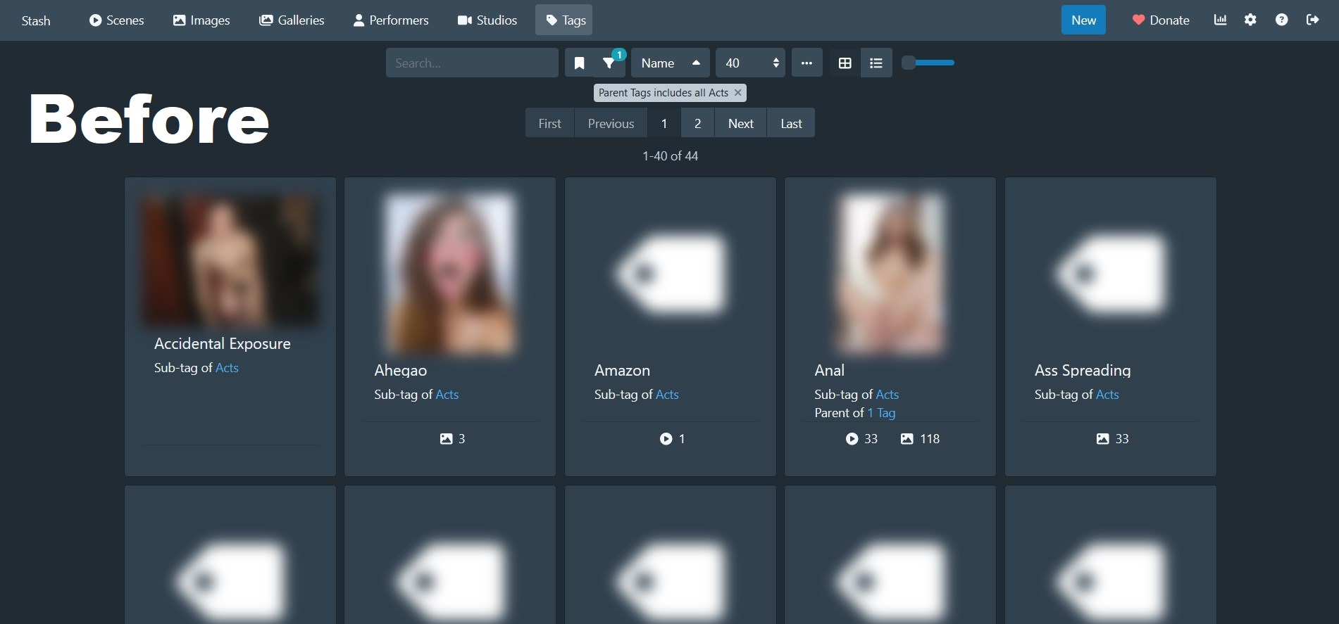 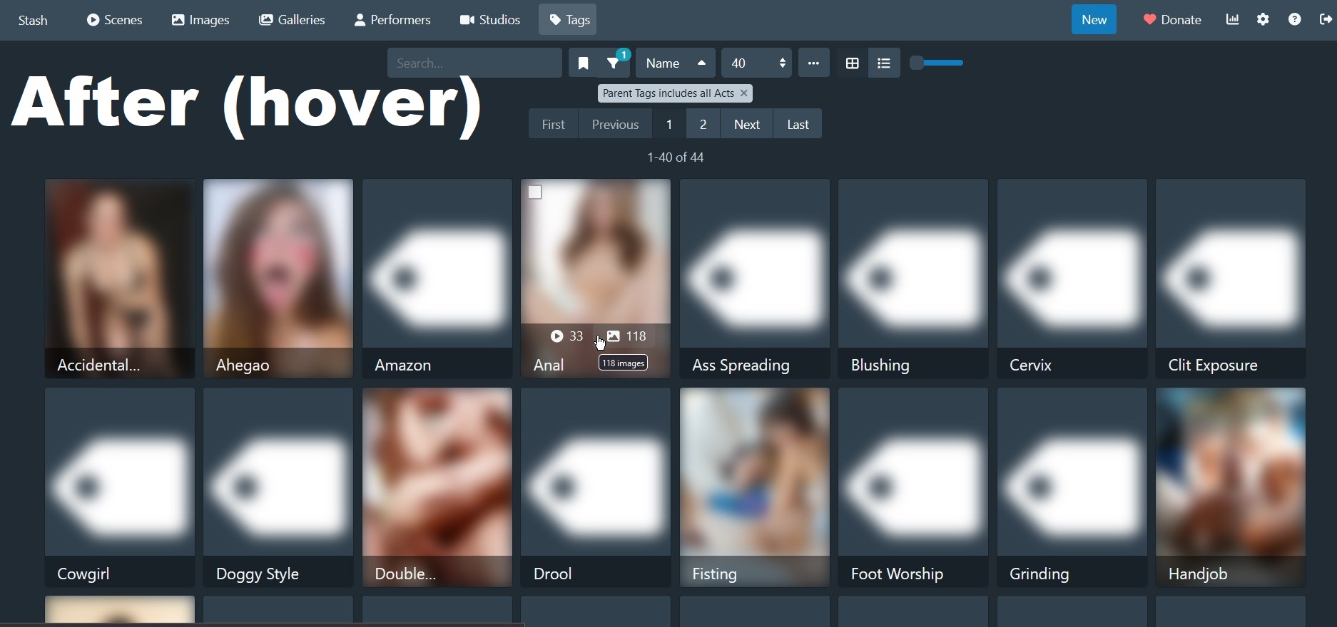 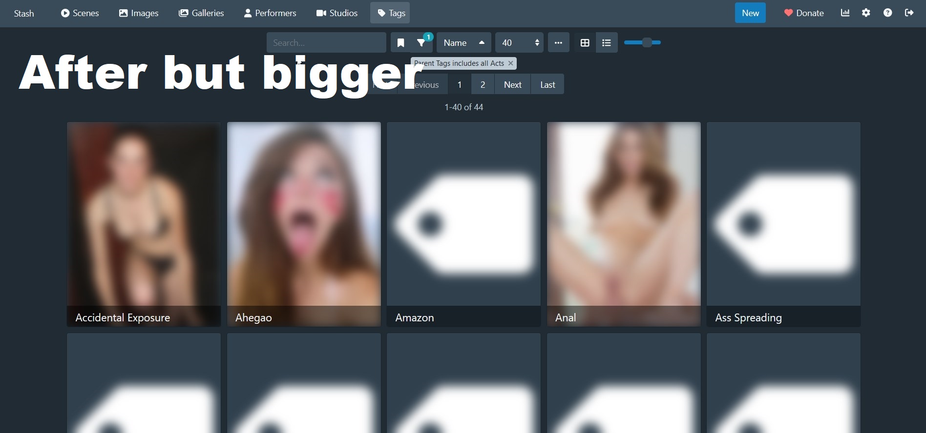 |
/*Tag layout changes*/
.tag-card {
	width: 16rem;
	padding: 0;
}

.tag-card .card-section {
	height: 2.5rem;
	position: absolute;
	bottom: 0;
	left: 0;
	right: 0;
	background: #0000007a;
	line-height: none;
}
.tag-card .card-section .TruncatedText {
	-webkit-line-clamp: 1 !important;
}
.tag-card h1,
h2,
h3,
h4,
h5,
h6,
.h1,
.h2,
.h3,
.h4,
.h5,
.h6 {
	line-height: normal;
}
.tag-card hr,
.tag-description {
	display: none;
}
.tag-card .btn-group {
	position: absolute;
	width: 100%;
	bottom: 2.5rem;
	margin-bottom: 0;
	opacity: 0;
	transition: ease 0.2s;
}
.tag-card .btn-group:hover {
	opacity: 1;
	transition: ease 0.2s;
	background: #0000007a;
}

.tag-card-image {
	object-fit: cover;
	object-position: center;
}

.zoom-0 .tag-card-image {
	max-height: none;
	height: 16rem;
	width: 12rem;
}

.zoom-1 .tag-card-image {
	max-height: none;
	height: 20rem;
	width: 15rem;
}

.zoom-2 .tag-card-image {
	max-height: none;
	height: 24rem;
	width: 18rem;
}

.zoom-3 .tag-card-image {
	max-height: none;
	height: 28rem;
	width: 21rem;
}

.zoom-0.tag-card,
.zoom-1.tag-card,
.zoom-2.tag-card,
.zoom-3.tag-card {
	width: initial;
}

.tag-card .card-section > a {
	position: absolute;
	width: 100%;
	height: 100%;
	display: block;
	left: 0;
	right: 0;
	top: 0;
	bottom: 0;
	padding: 7px 14px 0px 14px;
}
.tag-card .card-section .tag-sub-tags {
	position: relative;
	margin-top: 2rem;
	z-index: 1;
}
.tag-sub-tags {
	font-size: 0;
}
.tag-parent-tags {
	display: none;
}
Subtag explorer
| Description | This snipset includes the above tag layout snipset with a twist. Its meant to be used for people who use subtags as a hierachy. For example Watermelon is a subtag of Fruits, so when i click Fruits i want to see both oranges and watermelons, but i might want to get into the list of fruits subtags more easily. That what this snipset is used for. Any tag that has a subtag will show a (…) icon. When clicking its name you will show all subtags of this tag. if you click its image, it will instead open the tag itself normaly. You can change ‘137cbd’ in the icon url to any color you want to match you theme |
| Author | hijack_hornet |
| Screenshots | 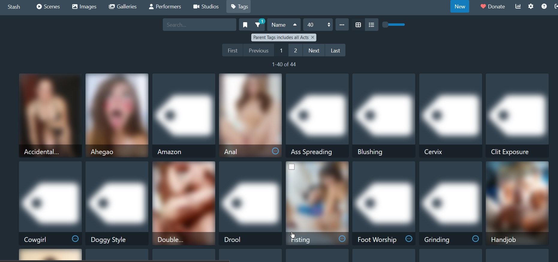 |
/*Tag layout changes*/
.tag-card {
	width: 16rem;
	padding: 0;
}

.tag-card .card-section {
	height: 2.5rem;
	position: absolute;
	bottom: 0;
	left: 0;
	right: 0;
	background: #0000007a;
	line-height: none;
}
.tag-card .card-section .TruncatedText {
	-webkit-line-clamp: 1 !important;
}
.tag-card h1,
h2,
h3,
h4,
h5,
h6,
.h1,
.h2,
.h3,
.h4,
.h5,
.h6 {
	line-height: normal;
}
.tag-card hr,
.tag-description {
	display: none;
}
.tag-card .btn-group {
	position: absolute;
	width: 100%;
	bottom: 2.5rem;
	margin-bottom: 0;
	opacity: 0;
	transition: ease 0.2s;
}
.tag-card .btn-group:hover {
	opacity: 1;
	transition: ease 0.2s;
	background: #0000007a;
}

.tag-card-image {
	object-fit: cover;
	object-position: center;
}

.zoom-0 .tag-card-image {
	max-height: none;
	height: 16rem;
	width: 12rem;
}

.zoom-1 .tag-card-image {
	max-height: none;
	height: 20rem;
	width: 15rem;
}

.zoom-2 .tag-card-image {
	max-height: none;
	height: 24rem;
	width: 18rem;
}

.zoom-3 .tag-card-image {
	max-height: none;
	height: 28rem;
	width: 21rem;
}

.zoom-0.tag-card,
.zoom-1.tag-card,
.zoom-2.tag-card,
.zoom-3.tag-card {
	width: initial;
}

.tag-card .card-section > a {
	position: absolute;
	width: 100%;
	height: 100%;
	display: block;
	left: 0;
	right: 0;
	top: 0;
	bottom: 0;
	padding: 7px 14px 0px 14px;
}
.tag-card .card-section .tag-sub-tags {
	position: relative;
	margin-top: 2rem;
	z-index: 1;
}
.tag-sub-tags {
	font-size: 0;
}
.tag-parent-tags {
	display: none;
}
/*Tag subtag exploration snipset*/
.tag-card .card-section > a {
	cursor: default;
	pointer-events: none;
}
.tag-card .card-section > hr {
	margin-top: 2rem;
}
.tag-card .card-section .tag-sub-tags {
	position: absolute !important;
	margin-top: 0 !important;
	width: 100%;
	height: 100%;
	display: block;
	left: 0;
	right: 0;
	top: 0;
	bottom: 0;
	padding: 0;
}
.tag-sub-tags::before {
	content: "";
	display: block;
	background: url("https://img.icons8.com/material-outlined/24/137cbd/connection-status-off.png")
		no-repeat;
	background-size: 1.5rem 1.5rem;
	width: 1.5rem;
	height: 1.5rem;
	float: right;
	margin: 0.5rem 0.5rem 0 0;
}
.tag-sub-tags > a {
	width: 100%;
	height: 100%;
	display: block;
}

.tag-card .btn-group a {
	z-index: 10;
}
.tag-sub-tags {
	font-size: 0;
}
.tag-parent-tags {
	display: none;
}
Global
Change the order of navigation bar buttons
| Description | Use order values below 0 to move specific buttons to the left of the non-ordered buttons, and values above 1 to move them to the right of the non-ordered buttons. |
| Author | |
| Screenshots | Before After  |
/* [Global changes] Change the order of navigation bar buttons */

nav .navbar-nav:first-child {
  display: flex;
  flex-direction: row;
}
div.nav-link[data-rb-event-key="/tags"] {
  order: -2;
}
div.nav-link[data-rb-event-key="/movies"] {
  order: -1;
}
div.nav-link[data-rb-event-key="/scenes"] {
  order: 1;
}
Hide the Donate button
| Description | Hide the Donate button. |
| Author | |
| Screenshots | |
/* [Global changes] Hide the Donate button */

.btn-primary.btn.donate.minimal {
  display: none;
}
Blur NSFW images
| Description | Use for when working on stash but don’t want to expose NSFW images and text. May not be exhaustive. |
| Author | |
| Screenshots | |
/* [Global changes] Blur NSFW images */

.scene-card-preview-video,
.scene-card-preview-image,
.image-card-preview-image,
.image-thumbnail,
.gallery-card-image,
.performer-card-image,
.tag-card-image,
img.performer,
.movie-card-image,
.gallery .flexbin img,
.wall-item-media,
.scene-studio-overlay .image-thumbnail,
.image-card-preview-image,
#scene-details-container .text-input,
#scene-details-container .scene-header,
#scene-details-container .react-select__single-value,
.scene-details .pre,
#scene-tabs-tabpane-scene-file-info-panel span.col-8.text-truncate > a,
.gallery .flexbin img,
.movie-details .logo {
 filter: blur(12px);
}

.scene-card-video {
 filter: blur(13px);
}

.jw-video,
.jw-preview,
.jw-flag-floating,
.image-container,
.studio-logo,
.scene-cover {
 filter: blur(20px);
}

.movie-card .text-truncate,
.scene-card .card-section {
 filter: blur(4px);
}
Blur NSFW images and unblur on mouse over
| Description | Blur NSFW images and unblur on mouse over. |
| Author | fl0w#9497 |
| Screenshots | 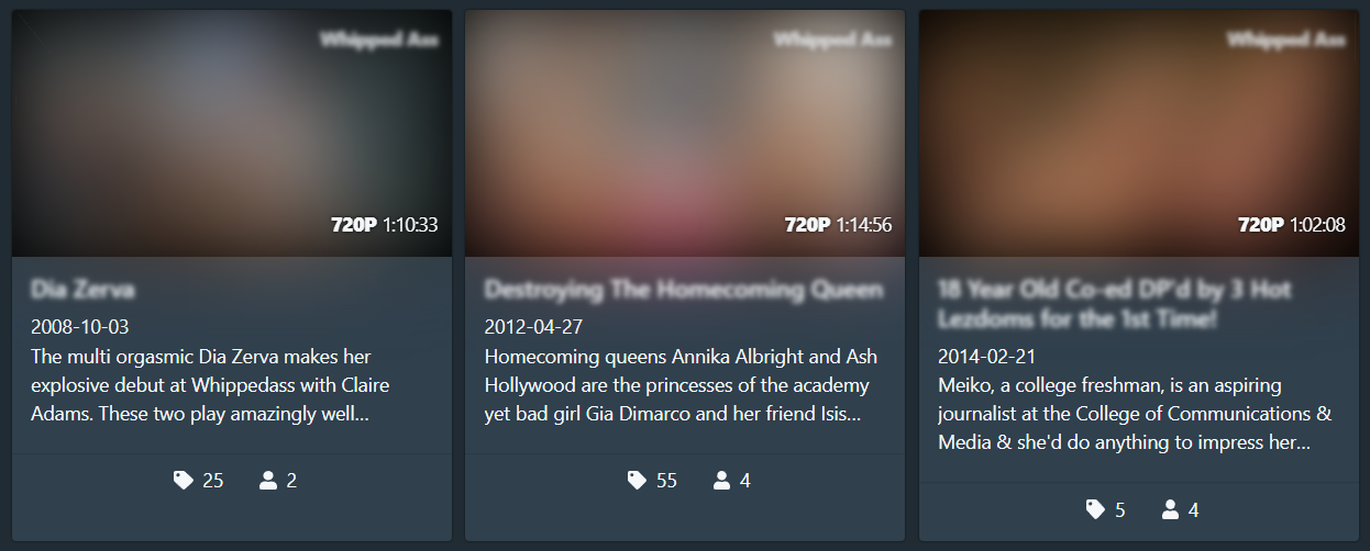 |
/* [Global changes] Blur NSFW images and unblur on mouse over */
/* === MORE BLUR === */
/* scene */
.scene-card-preview,
.vjs-poster,
video,
.scene-cover,
.scrubber-item,

/* image */
.image-card-preview,
.image-image,
.gallery-image,

/* movie */
.movie-card-image,
.movie-images,

/* gallery */
.gallery-card-image,
table > tbody > tr > td > a > img.w-100,

/* performer */
.performer-card-image,
img.performer,

/* studio */
.studio-card-image,

/* tag */
.tag-card-image

{
 filter: blur(30px);
}

/* === LESS BLUR === */
/* common */
.card-section-title,

/* scene */
.scene-studio-overlay,
.scene-header > h3,
h3.scene-header,
.studio-logo,
.image-thumbnail,

/* image */
h3.image-header,

/* movie */
.movie-details > div > h2,

/* gallery */
h3.gallery-header,

/* studio */
.studio-details .logo,
.studio-details > div > h2,

/* tag */
.logo-container > .logo,
.logo-container > h2

{
 filter: blur(2px);
}

/* === UNBLUR ON HOVER === */
/* common */
.thumbnail-section:hover *,
.card:hover .card-section-title,

/* scene */
.card:hover .scene-studio-overlay,
.video-js:hover .vjs-poster,
video:hover,
.scene-header:hover > h3,
div:hover > .scene-header,
.studio-logo:hover,
.scene-cover:hover,
.image-thumbnail:hover,
.scene-card-preview:hover,
.scrubber-item:hover,

/* image */
.image-image:hover,
div:hover > .image-header,
.gallery-image:hover,

/* movie */
.movie-images:hover,
.movie-details > div > h2:hover,

/* gallery */
div:hover > .gallery-header,
table > tbody > tr > td:hover > a > img.w-100,

/* performer */
img.performer:hover,

/* studio */
.studio-details .logo:hover,
.studio-details:hover > div > h2,

/* tag */
.logo-container > .logo:hover,
.logo-container:hover > h2
{
 filter: blur(0px);
}
Hide 0 count badges
| Description | Hide 0 count badges. |
| Author | echo6ix |
| Screenshots |  |
/* [Global changes] Hide 0 count badges */
span.badge[data-value="0"] {
    display: none;
}
Border around cards activated with checkbox selection
| Description | Add a noticeable border around any cards that have been selected using the checkbox selection. Border color uses Stash’s --primary color variable to maintain consistency with any theme that uses Stash’s color variables. |
| Author | echo6ix |
| Screenshots | 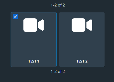 |
/* [Global changes] Modify card when checkbox is selected */
.grid-card.card:has(input:checked) {
   box-shadow: 0 0 0 1px var(--primary,rgba(255, 255, 255, 0.30));
}