Plex
Table of Contents
This is a community created theme for Stash inspired by the popular Plex Interface. Installation is quick and easy so you should be ready to install it in just a few simple steps.
Feel free to experiment with CSS and modify it to fit your needs. In case you have any issues or improvements we will be happy to hear from you on our Discord server! You can also submit a PR to share improvements with others!
The Plex Theme will only change the look and feel of the Stash interface. It will not affect any other data, so you are all safe and sound! :heart:
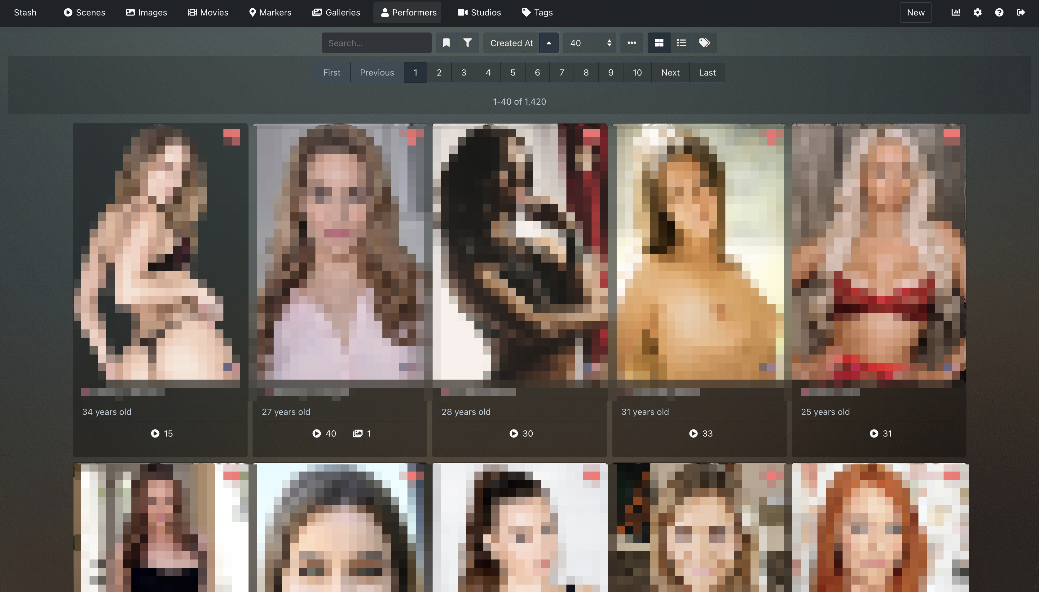
Screenshots
Install
- Open User Interface Configuration panel in settings. (http://localhost:9999/settings?tab=interface)
- Tick/Enable Custom CSS ✅
- Copy & Paste CSS Code to the Custom CSS text area.
Optional - Host Backgrounds Locally
These steps are optional, by default this theme uses the Github hosted image links.
-
Download plex-background.png and plex-noise.png
-
Place
plex-background.pngandplex-noise.pngin~/.stashon macOS / Linux orC:\Users\YourUsername\.stashon Windows. Then edit thebackground-image: url("")attributes like below:- Replace line
background-image: url("https://user-images.githubusercontent.com/63812189/79506691-4af78900-7feb-11ea-883e-87b8e05ceb1c.png");withbackground-image: url("./plex-background.png"); - Replace line
background: rgba(0, 0, 0, 0) url("https://user-images.githubusercontent.com/63812189/79506696-4c28b600-7feb-11ea-8176-12a46454d87a.png") repeat scroll 0% 0%;withbackground: rgba(0, 0, 0, 0) url("./plex-noise.png") repeat scroll 0% 0%;
- Replace line
CSS Code
/*
Originally created by Fidelio 2020
StashApp Plex Theme - v1.0.5
*/

body {
	background-image: url("https://user-images.githubusercontent.com/63812189/79506691-4af78900-7feb-11ea-883e-87b8e05ceb1c.png");
	width: 100%;
	height: 100%;
	background-size: cover;
	background-repeat: no-repeat;
	background-color: #3f4245;
	background-attachment: fixed;
	background-position: center;
}

#root {
	background: rgba(0, 0, 0, 0) url("https://user-images.githubusercontent.com/63812189/79506696-4c28b600-7feb-11ea-8176-12a46454d87a.png") repeat scroll 0% 0%;
	position: absolute;
	width: 100%;
	height: 100%;
	z-index: 2;
}

* {
	scrollbar-color: hsla(0, 0%, 100%, .2) transparent;
}

.bg-dark {
	background-color: #1f2326!important;
}

.job-table.card,
.card {
	background-color: #30404d;
	border-radius: 3px;
	box-shadow: 0 0 0 1px rgba(16, 22, 26, .4), 0 0 0 rgba(16, 22, 26, 0), 0 0 0 rgba(16, 22, 26, 0);
	padding: 20px;
	background-color: rgba(0, 0, 0, .3);
}

.bg-secondary {
	background-color: #313437 !important;
}

.text-white {
	color: #eee !important;
}

.border-secondary {
	border-color: #2f3335 !important;
}

.btn-secondary.filter-item.col-1.d-none.d-sm-inline.form-control {
	background-color: rgba(0, 0, 0, .15);
}

.btn-secondary {
	color: #eee;
	background-color: rgba(0, 0, 0, .15);
}

a {
	color: hsla(0, 0%, 100%, .45);
}

.btn.active {
	background-color: #2f3335;
	color: #f5f8fa;
}

minimal.w-100.active.btn.btn-primary {
	background-color: #2f3335;
	color: #f5f8fa;
}

.btn-primary {
	color: #fff;
	background-color: #1f2326;
	border-color: #374242;
}

.nav-tabs .nav-link.active {
	color: #eee;
}

.nav-tabs .nav-link.active:hover {
	border-bottom-color: #eee;
	outline: 0;
}

.nav-tabs .nav-link {
	outline: 0;
}

.input-control,
.input-control:focus {
	background-color: rgba(16, 22, 26, .3);
}

#performer-page .image-container .performer {
	background-color: rgba(0, 0, 0, .45);
	box-shadow: 0 0 2px rgba(0, 0, 0, .35);
}

.btn-primary:not(:disabled):not(.disabled).active,
.btn-primary:not(:disabled):not(.disabled):active,
.show>.btn-primary.dropdown-toggle {
	color: #fff;
	border-color: #eee;
}

.nav-pills .nav-link.active,
.nav-pills .show>.nav-link {
	background-color: #1f2326;
}

.btn-primary.focus,
.btn-primary:focus,
.btn-primary:not(:disabled):not(.disabled).active:focus,
.btn-primary:not(:disabled):not(.disabled):active:focus,
.show>.btn-primary.dropdown-toggle:focus {
	box-shadow: none;
}

.btn-primary:not(:disabled):not(.disabled).active,
.btn-primary:not(:disabled):not(.disabled):active,
.show>.btn-primary.dropdown-toggle {
	color: #fff;
	background-color: #2f3335;
	border-color: #eee;
}

input[type="range"]::-moz-range-track {
	background: hsla(0, 0%, 100%, .25);
}

input[type="range"]::-moz-range-thumb {
	background: #bcbcbc;
}

div.react-select__control {
	background-color: hsla(0, 0%, 39.2%, .4);
	color: #182026;
	border-color: #394b59;
	cursor: pointer;
}

.scene-wall-item-text-container {
	background: radial-gradient(farthest-corner at 50% 50%, rgba(50, 50, 50, .5) 50%, #323232 100%);
	color: #eee;
}

.filter-container,
.operation-container {
	background-color: rgba(0, 0, 0, .15);
	box-shadow: none;
	margin-top: -10px;
	padding: 10px;
}

.container-fluid,
.container-lg,
.container-md,
.container-sm,
.container-xl {
	width: 100%;
	margin-right: 0px;
	margin-left: 0px;
}

.btn-link {
	font-weight: 500;
	color: #eee;
	text-decoration: none;
}

button.minimal.brand-link.d-none.d-md-inline-block.btn.btn-primary {
	text-transform: uppercase;
	font-weight: bold;
}

a:hover {
	color: hsla(0, 0%, 100%, .7);
}

option {
	background-color: #1f2326;
}
.folder-list .btn-link {
    color: #2c2e30;
}

#performer-scraper-popover {
  z-index: 10;
}

#tasks-panel .tasks-panel-queue {
  background: rgba(0, 0, 0, 0);
}

div.react-select__menu-portal {
  z-index: 2;
}