Light Pulsar
Table of Contents
Light Pulsar Theme for Stash
A new custom theme for Stash. Installation is quick and easy so you should be ready to install it in just a few simple steps.
Feel free to experiment with CSS and modify it to fit your needs. In case you have any issues or improvements we will be happy to hear from you on our Discord server!
The Theme will only change the look&feel of the Stash interface. It will not affect any other data, so you are all safe and sound! :heart:
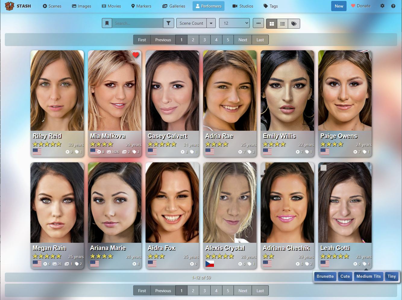
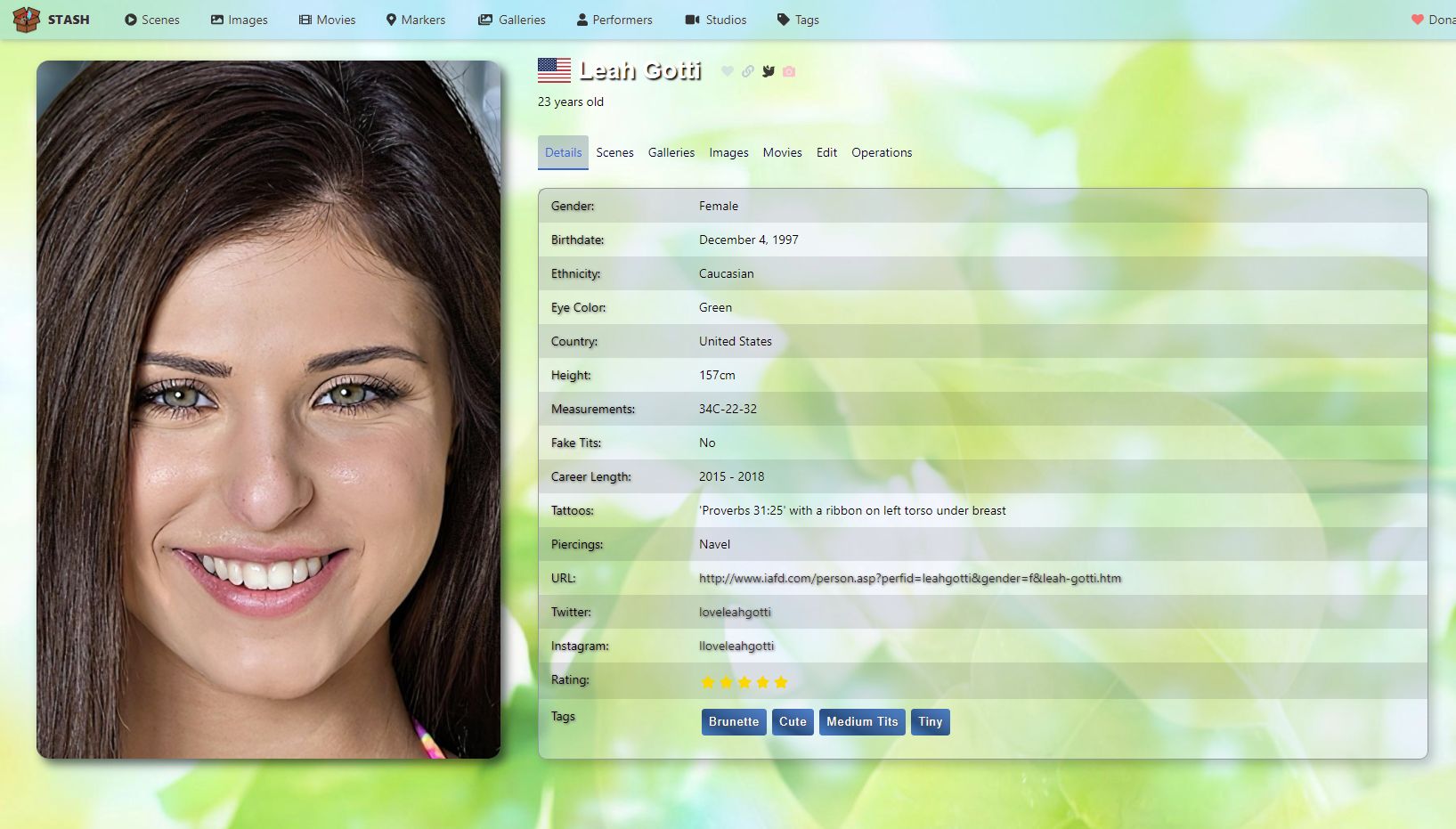
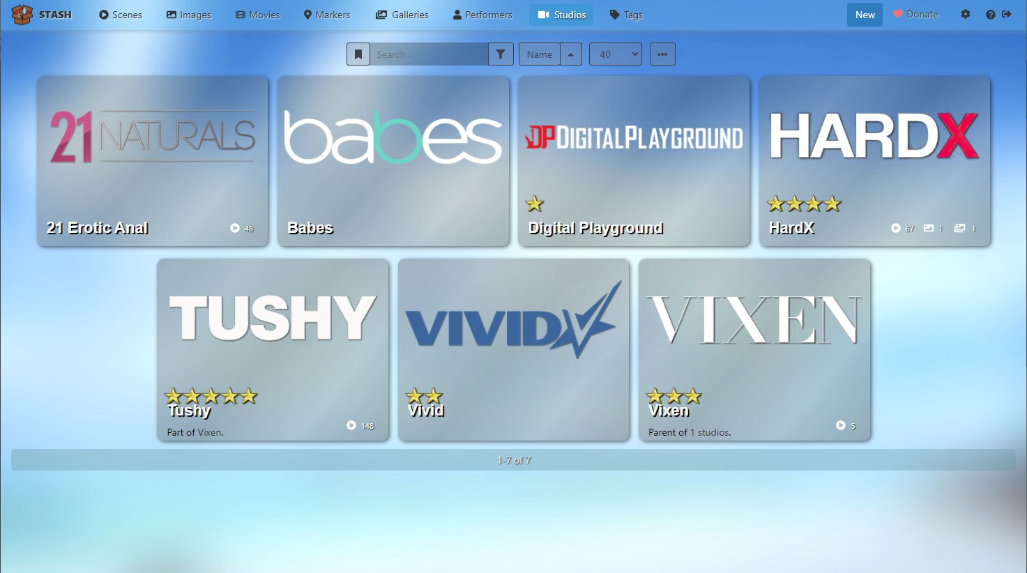
Screenshots
Install
- Open User Interface Configuration panel in settings. (http://localhost:9999/settings?tab=interface)
- Tick/Enable Custom CSS ✅
- Copy&Paste CSS Code to the Custom CSS text area.
- Select one of the background images that you find at the top of the CSS code by removing the commentary ( /* ) at the beginning of the line (Flower is the standard background), or use your own wallpaper as “background.jpg”, and place the image in
~/.stash/customon macOS / Linux orC:\Users\YourUsername\.stash\customon Windows.
Enjoy!
CSS Code
/*		Light Pulsar Theme - Fonzie 2021 v0.3.1		 */
/* ---------------------------------------------------- */
/* --------- Updated to Stash version 0.12.0 ---------- */

/*
	Bug Fixes: Overlap of Help & Ssettings" buttons in the navbar, as well
	as the Identify task

	Complete overhaul of the Settings page

	Bug Fix: Background-color in the navigation bar

	Adjustments to version 0.10.0 which includes moving the movie-, image-
	and gallery-counter to the bottom of the performer image when you hover
	over the card, and increasing the size of the star rating in the highest
	zoom level.
*/


/* ===================== General ===================== */

body {
	background-image:url("https://i.imgur.com/UwICmXP.jpg");	/* Flower			*/
/*	background-image:url("https://i.imgur.com/zqt3MFY.jpg");	/* Green Leaves 	*/
/*	background-image:url("https://i.imgur.com/vCotzwB.jpg");	/* White Desert	*/
/*	background-image:url("https://i.imgur.com/Lverfqy.jpg");	/* Tropic Beach	*/
/*	background-image:url("https://i.imgur.com/4jrpuyR.jpg");	/* White Blue Waves	*/
/*	background-image:url("https://i.imgur.com/KUtfQzs.jpg");	/* Bright Lights	*/

	width: 100%;
	height: 100%;
	padding: 0 0 0;
	background-size: cover;
	background-repeat: no-repeat;
	background-color:#127aa5;
	background-attachment: fixed;
	background-position: center;
	color: #f9fbfd;
	color:#000;
}

h1, h2, h3{ 	color:#fff;}

:root {
	--HeaderFont: Helvetica, "Helvetica Neue", "The Sans", "Segoe UI";
	--std-txt-shadow: 2px 2px 1px #000;
	--light-txt-shadow: 1px 1px 3px #555;
	--white: #ffffff;
	--stars: url("https://i.imgur.com/YM1nCqo.png");
	--fourTwo: 0.35;
}


/* --- The Home button in the top left corner of each page. Remove the last 3 lines if you don't like the logo --- */
button.minimal.brand-link.d-none.d-md-inline-block.btn.btn-primary,
button.minimal.brand-link.d-inline-block.btn.btn-primary {
	text-transform: uppercase;
	font-weight: bold;
	margin-left:1px;
	background-image:url("./favicon.ico");
	padding-left:40px;
	background-repeat: no-repeat;
}

/* --- Makes the background of the Navigation Bar at the Top half-transparent --- */
nav.bg-dark {background: rgba(100, 200, 250, var(--fourTwo))!important;color:#000}
.bg-dark {background:none !important;background-color:none !Important}
.form-group .bg-dark {background: rgba(10, 20, 25, 0.20)!important;}

.navbar-buttons.navbar-nav a.nav-utility {margin-right:9px}


/* --- The space between the Navigation Bar and the rest of the page --- */
.main { margin-top:18px }
.top-nav { padding: .13rem 1rem; }


/* --- Changes how the Bar at the top of the page behaves --- */
.fixed-bottom, .fixed-top { position: relative !important; top:0px !important}


/* The pagination at the top and at the bottom of the Scenes/Performer/Images/... pages;
transparent background, rounded corners, etc. */
.filter-container, .operation-container {
	background-color: rgba(100, 150, 160, .35);
	box-shadow: none;
	margin-top: 6px;
	border-radius: 5px;
	padding: 5px;
}


/* --- Changes the space between the button in the top right corner of the page --- */
.order-2 button { margin-left: 4px }

/* --- Space between the items in the Nav bar --- */
.nav-link > .minimal {  margin: 0px;}


/* Each item on the Scenes/Performers/Tags/... pages */
.card {
	padding: 20px;
	margin: 4px 0.5% 14px;
	/* --- Adds a glowing shimmer effect --- */
	background-image: linear-gradient(130deg, rgba(60, 70, 85,0.21), rgba(150, 155, 160,0.30), rgba(35, 40, 45,0.20), rgba(160, 160, 165,0.21), rgba(70, 80, 85,0.27));
	background-color: rgba(106, 120, 125, .25);
	box-shadow: 2px 2px 6px rgba(0, 0, 0, .55);
	/* --- Increases the rounded borders of each item on the Scenes/Performers/... pages for 6px in 10px --- */
	border-radius: 10px;
}

/* --- Removes the glowing shimmer effect on the start page & the settings for readability purpose --- */
.mx-auto.card, .changelog-version.card {
	background-image: none !important;
	background-color: rgba(16, 20, 25, .40) !important;
}

/* --- Color that is used within .card secments --- */
.text-muted {	color: #eee !important;   	text-shadow: 1px 1px 2px #000;}


.bg-secondary {
	background: none;
	background-color: rgba(10, 25, 30, .3) !important;
}

.text-white {	color: #333 }
.border-secondary {	border-color: #2f3335 }

.btn-secondary.filter-item.col-1.d-none.d-sm-inline.form-control {
    background-color: rgba(0, 0, 0, .08);
}

/* --- Changes the color and the background of the buttons and elements in the toolbar (Search, Sort by, # of Items, etc.) --- */
.btn-secondary {
    color: #eef;
    background-color: rgba(45, 45, 45, .28);
    border-color: #3c3f45;
}
.btn-toolbar .btn-secondary {    color: #404049;     background-color: rgba(130, 130, 140, .28);}


a {	color: hsla(0, 10%, 10%, .85);}


/* --- Changes the color of the active page in the Navgation Bar --- */
.btn-primary:not(:disabled):not(.disabled).active,
.btn-primary:not(:disabled):not(.disabled):active,
.show>.btn-primary.dropdown-toggle {
	color: #fff;
	background-color: rgba(15, 150, 205, .6);
	border-color: #fff;
}

/* --- No border of the active element in the Navgation Bar --- */
.btn-primary.focus,
.btn-primary:focus,
.btn-primary:not(:disabled):not(.disabled).active:focus,
.btn-primary:not(:disabled):not(.disabled):active:focus,
.show>.btn-primary.dropdown-toggle:focus {box-shadow: none;}

.btn-primary:not(:disabled):not(.disabled).active,
.btn-primary:not(:disabled):not(.disabled):active,
.show>.btn-primary.dropdown-toggle {
	color: #fff;
	border-color: #eee;
    text-shadow: 1px 1px 2px #333;
    }

.container-fluid,.container-lg,.container-md,.container-sm,.container-xl {
	width: 100%;
	margin-right: 0px;
	margin-left: 0px;
}


/* ===================== Performer ========================= */


/* --- 0.90 - Section moves Movie-, Image- & Gallery-Count to the bottom of the performer image when hovered over --- */
.performer-card .card-popovers .movie-count,
.performer-card .card-popovers .image-count,
.performer-card .card-popovers .gallery-count
{
	z-index:300;
    position:absolute;
    top:-270%;
	opacity:0.0;
}

/* --- Highlight the bottom of the performer card when hovered over --- */
.performer-card.grid-card:hover {
	background-image: linear-gradient(130deg, rgba(50, 60, 75,0.25), rgba(150, 155, 160,0.32), rgba(35, 40, 45,0.26), rgba(160, 160, 165,0.27), rgba(50, 60, 65,0.37));
	background-color: rgba(102, 112, 120, .25);
}

/* --- When hovered over blend them in ---*/
.performer-card.grid-card:hover .card-popovers .movie-count,
.performer-card.grid-card:hover .card-popovers .image-count,
.performer-card.grid-card:hover .card-popovers .gallery-count {opacity: 1.0;transition: opacity .7s;}

/* --- 3 items gets a shadow ---*/
.performer-card .card-section .movie-count span,
.performer-card .card-section .movie-count button.minimal,
.performer-card .card-section .image-count span,
.performer-card .card-section .image-count button.minimal,
.performer-card .card-section .gallery-count span,
.performer-card .card-section .gallery-count button.minimal
{text-shadow: 2px 2px 1px #000, 1px 1px 1px #000, 4px 4px 5px #333, 9px 0px 5px #333, -3px 2px 4px #333, -7px 0px 5px #333, -1px -6px 5px #333, 3px -2px 6px #444;}

/* --- Positioning of the 3 items ---*/
.performer-card .card-popovers .movie-count {left:0.2%;}
.performer-card .card-popovers .image-count {left:32.8%}
.performer-card .card-popovers .gallery-count {right:1.3%}

.performer-card .movie-count a.minimal:hover:not(:disabled), .performer-card .movie-count button.minimal:hover:not(:disabled),
.performer-card .image-count a.minimal:hover:not(:disabled), .performer-card .image-count button.minimal:hover:not(:disabled),
.performer-card .gallery-count a.minimal:hover:not(:disabled), .performer-card .gallery-count button.minimal:hover:not(:disabled)
{
	background-color:rgba(20,80,110,0.92);
    color:#fff;
}

/* --- Affects the Scenes- and Tags-Counter --- */
a.minimal:hover:not(:disabled), button.minimal:hover:not(:disabled) {background: rgba(138,155,168,.45);color:#fff;}
div.performer-card div.card-popovers
{
	margin-bottom:-3px;
	margin-left:3%;
	margin-top:-4px;
	margin-right: -1px;
	justify-content: flex-end;
	text-align:right;
}

div.card-section hr {display:none}


/* --- Changes the width of the Performer Card from 280px to a dynamic system and therefore the size of the image --- */
/* --- In Full screen HD 1920x1080 you now see 8 performers per row instead of 6 --- */
/*.performer-card-image, .performer-card, .card-image {  min-width: 160px; width: calc(108px + 10.625vw / 2); max-width: 230px }  */
/*.performer-card-image, .performer-card, .card-image {  min-width: 160px; width: calc(108px + 19vw / 3.6);width:212px; max-width: 230px } */
.performer-card-image, .performer-card, .card-image {  min-width: 160px; width: calc(100px + 11.2vw / 1.92);max-width: 230px }


/* --- Changes the height of the Performer Card to keep the 2x3 picture ratio --- */
/*.performer-card-image, .justify-content-center .card-image { min-height:240px; height: calc((108px + 10.625vw / 2) * 1.5); max-height: 345px}  */
.performer-card-image, .justify-content-center .card-image { min-height:240px; height: calc((112px + 19vw / 3.6) * 1.5); max-height: 345px;}
.performer-card-image, .justify-content-center .card-image { min-height:240px; height: calc((100px + 11.2vw / 1.92) * 1.5); max-height: 345px;}

@media (max-width: 575px), (min-width: 1200px) {
.scene-performers .performer-card-image { height: auto; }
.scene-performers .performer-card { width: auto; }
}


/* --- Fixes an issue of the card when watching a scene --- */
.image-section { display: cover;}

/* --- The name of the Performer. Different font, less space to the left & to the top, Text-Shadow --- */
.text-truncate, .card.performer-card .TruncatedText {
	margin-left:-1.5%;
	margin-top: -2px;
	width: 120%;
	font-family: var(--HeaderFont);
	font-size: 112%;
	line-height:130%;
	font-weight:bold;
	text-shadow: var(--std-txt-shadow);
}

/* --- Makes the Performer Name smaller when the screen is too small --- */
@media (max-width: 1200px) { .card.performer-card .TruncatedText { font-size: 104%; } }


/* --- Moves the Flag icon from the right side of the card to the left and makes the Flag image a little bit bigger --- */
.performer-card .flag-icon {
    height: 2rem;
    left: 0.6rem;
    bottom: 0.10rem;
    width: 28px;
}

/* --- Age and # of Scenes move from the left side to the right of the card --- */
/* --- Also makes sure that when playing a scenes "XX years old in this scene" doesn't overlap with the star rating --- */
.performer-card .text-muted {text-align:right;margin-top:-2px;margin-bottom:1px;width:46%;margin-left:54%}


/* --- "removes" the term 'old.' from "xx years old." when the resolution gets to small --- */
@media (max-width: 1520px) {
div.card.performer-card .text-muted {text-align:right;margin-top:-2px;margin-bottom:1px;margin-right:-33px;max-height:20px;overflow:hidden;}
}

/* --- To prevent overlapping in the performer card when watching a scene --- */
@media (max-width: 2000px) {
.tab-content div.card.performer-card .text-muted {margin-top:22px;margin-right:-3px}
.tab-content .performer-card.card .rating-1,
.tab-content .performer-card.card .rating-2,
.tab-content .performer-card.card .rating-3,
.tab-content .performer-card.card .rating-4,
.tab-content .performer-card.card .rating-5 {bottom: 53px !important;}
}


/* --- Text Shadow for the "Stars in x scenes" link --- */
div.card.performer-card div.text-muted a {text-shadow: 1px 2px 2px #333}

/* --- Minimum height for the section in case Age is missing and elements would overlap --- */
.performer-card .card-section {min-height:82px}

/* --- Makes the card section (Name, Age, Flag, # of scenes) more compact --- */
.card-section { margin-bottom: -8px !important; padding: .5rem 0.7rem 0 !important;}
.card-section span {margin-bottom:3px}
@media (max-width: 1500px) {	.card-section span {font-size:11px}	}

div.card-section hr {display:none}


/* --- Changes regarding the Favorite <3 --- */
.performer-card .favorite {
    color: #f33;
    -webkit-filter: drop-shadow(2px 2px 3px rgba(0, 0, 0, .95));
	filter: drop-shadow(2px 2px 3px rgba(0, 0, 0, .95));
	right: 3px;
	top: 5px;
}


/* --- Turns the Rating Banner in the top left corner into a Star Rating under the performer name --- */
.performer-card.card .rating-1, .performer-card.card .rating-2, .performer-card.card .rating-3,
.performer-card.card .rating-4, .performer-card.card .rating-5
{
	background:none;
	background-size: 97px 18px;
	background-image:var(--stars);
	-webkit-transform:rotate(0deg);
	transform:rotate(0deg);
	padding:0;
	padding-bottom:1px;
	box-shadow: 0px 0px 0px rgba(0, 0, 0, .00);
	left:6px;
	width:97px;
	height:18px;
	text-align:left;
	position:absolute;
	top:auto;
	bottom: 34px;
	font-size:0.001rem;
}

/* --- Display only X amount of stars  -- */
div.performer-card.card .rating-banner.rating-1 {width:20px}
div.performer-card.card .rating-banner.rating-2 {width:39px}
div.performer-card.card .rating-banner.rating-3 {width:59px}
div.performer-card.card .rating-banner.rating-4 {width:78px}
div.performer-card.card .rating-banner.rating-5 {width:97px}


.performer-card .btn {padding: .34rem .013rem}
.performer-card .fa-icon {margin: 0 2px}
.performer-card .card-popovers .fa-icon {margin-right: 3px}
.performer-card .svg-inline--fa.fa-w-18, .performer-card .svg-inline--fa.fa-w-16 {height: 0.88em}
.performer-card .favorite .svg-inline--fa.fa-w-16 {height:1.5rem}


.performer-card .card-popovers .btn-primary {
    margin: 0 2px 0 11px;
}


/* --- PerformerTagger Changes --- */

.PerformerTagger-performer {
	background-image: linear-gradient(130deg, rgba(50, 60, 75,0.25), rgba(150, 155, 160,0.32), rgba(35, 40, 45,0.26), rgba(160, 160, 165,0.27), rgba(50, 60, 65,0.37));
	background-color: rgba(16, 20, 25, .23);
	box-shadow: 2px 2px 6px rgba(0, 0, 0, .70);
	border-radius: 8px;
	margin: 1.1%;
  }

.tagger-container .input-group-text  {background:none;border:0;margin-right:5px;padding-left:0}
.PerformerTagger-details {	margin-left: 1.25rem; width:23.5rem;}

.tagger-container .btn-link{text-shadow: 1px 2px 3px #000;}
.tagger-container, .PerformerTagger {	max-width: 1850px;}

.PerformerTagger-header h2 {
	font-family: Helvetica, "Helvetica Neue", "Segoe UI" !important;
	font-size: 2rem;
	line-height:130%;
	font-weight:bold;
	text-shadow: 2px 2px 1px #000 !important
}

.PerformerTagger-thumb {height: 145px;}
.PerformerTagger-performer-search button.col-6 {width:300px !important; flex-basis:100%;flex: 0 0 100%;
    max-width: 100%;}
.PerformerTagger-performer .performer-card {height:252px !important;}

.modal-backdrop 	 {	background-color: rgba(16, 20, 25, .25);}
.modal-backdrop.show {	opacity: 0.1;	}

.performer-create-modal {	max-width: 1300px; font-family: Helvetica, "Helvetica Neue", "Segoe UI" !important; }
.performer-create-modal .image-selection .performer-image { height: 95%; }
.performer-create-modal .image-selection {height: 485px;}

.performer-create-modal .no-gutters .TruncatedText {
	font-family: var(--HeaderFont);
	font-size: 115%;
	padding-top:2px;
	line-height:120%;
	font-weight:bold;
	text-shadow: var(--std-txt-shadow);
}
.performer-create-modal-field strong {margin-left: 6px}
.modal-footer {border-top: 0}


/* ========================= Performer Page ================================= */
/* === The page that you see when you click on the picture of a Performer === */

/* --- The picture of the Performer on the left. 3D effect thanks to background shadows and more rounded corners --- */
#performer-page .performer-image-container .performer
{
    background-color: rgba(0, 0, 0, .48);
    box-shadow: 6px 6px 11px rgba(0, 10, 10, .62);
    border-radius: 14px !important;
}

/* --- Without this the shadow at the bottom from the previous Selector will not be correctly displayed --- */
.performer-image-container {padding-bottom: 11px}


/* --- The following 15 Selectors change the way the details box is displayed --- */
#performer-details-tabpane-details .text-input, #performer-details-tabpane-details .text-input:disabled,
#performer-details-tabpane-details .text-input[readonly] {background-color: rgba(200,220,246,0.0);}
#performer-details-tabpane-details a { text-shadow: var(--light-txt-shadow)}

.text-input, input.form-control-plaintext { background-color:none;}
#performer-details .input-control, .text-input {box-shadow: none;}

div.react-select__control, #performer-details-tabpane-details {
	background-color: rgba(225,230,250,0.36);
	border:1px solid #999;
	max-width:1000px;
	box-shadow: 6px 6px 12px rgba(0, 10, 10, .22);
}
#performer-details-tabpane-details {border-radius: 10px}
#performer-details-tabpane-edit {max-width:1000px}

div.react-select__control .css-12jo7m5 {text-shadow: none; }

@media (min-width: 1200px) {
	#performer-details-tabpane-details td { padding: 9px; }
	table#performer-details tbody tr td:nth-child(1), td:first-child {padding-left: 22px; width: 185px;}
}
@media (max-width: 1200px) {
	table#performer-details tbody tr td:nth-child(1), td:first-child {padding-left: 11px; }
	#performer-page .performer-head {    margin-bottom: 1rem; }
	#performer-page { margin: 0 -6px 0 -15px; }
}
#performer-details-tabpane-details tr:nth-child(odd) {     background-color: rgba(16,22,26,0.1); }
table#performer-details {color:#FFF; text-shadow: 1px 1px 1px #000;}


/* --- Changes the way the name of the performer is displayed --- */
.performer-head h2 {font-family: var(--HeaderFont); font-weight:bold; text-shadow: 2px 2px 2px #111 }

/* --- Leave some space between the name and the Fav/Link/Twitter/IG icons --- */
#performer-page .performer-head .name-icons {margin-left: 22px}

/* --- Highlighter for active Details/Scenes/Images/Edit/Operations --- */
.nav-tabs .nav-item.show .nav-link, .nav-tabs .nav-link.active {
	background-color: rgba(135,160,165,0.5);
}

/* --- Changes the display of Performer Details Tab in the 0.9 version are arranged --- */
#performer-details-tabpane-details dl.row, dl.details-list dt, dl.details-list dd{ margin:0 0px;padding: 8px 10px 9px 14px}
#performer-details-tabpane-details dl.row:nth-child(odd),
#performer-details-tabpane-details dl.details-list dt:nth-of-type(odd),
#performer-details-tabpane-details dl.details-list dd:nth-of-type(odd) {	background-color: rgba(16,22,26,0.1);}
#performer-details-tabpane-details dt.col-xl-2,
#performer-details-tabpane-details dl.details-list dt {	text-shadow: var(--light-txt-shadow); font-weight: normal;}
#performer-details-tabpane-details ul.pl-0 {margin-bottom: 0rem;}
#performer-details-tabpane-details dl.details-list { grid-column-gap: 0}


/* --- Resets the fields in Performer Edit Tab in the 0.5 developmental version back to way it was in the 0.5 version --- */
#performer-edit {margin:0 0 0 10px}
#performer-edit .col-sm-auto, #performer-edit .col-sm-6, #performer-edit .col-md-auto, #performer-edit .col-lg-6, #performer-edit .col-sm-4, #performer-edit .col-sm-8 { width: 100%;max-width: 100%; flex: 0 0 100%; }
#performer-edit .col-sm-auto div, #performer-edit label.form-label { float:left; width:17%;}
#performer-edit .col-sm-auto div, #performer-edit label.form-label { font-weight:normal; color: #FFF; text-shadow: var(--std-txt-shadow); }

#performer-edit select.form-control, #performer-edit .input-group, #performer-edit .text-input.form-control { float:right; width:83%; }
#performer-edit .form-group, .col-12 button.mr-2 {margin-bottom: 0.35rem}
#performer-edit .mt-3 label.form-label { float:none; width:auto; }

#performer-edit select.form-control, #performer-edit .input-group, #performer-edit .text-input.form-control {width: 100%;}
#performer-edit textarea.text-input {min-height: 9ex;}

#performer-edit .form-group:nth-child(17) .text-input.form-control {width:85%;}

@media (max-width: 750px) {
#performer-edit .col-sm-auto div, #performer-edit label.form-label { float:left; width:22%;}
#performer-edit select.form-control, #performer-edit .input-group, #performer-edit .text-input.form-control { float:right; width:78%; }
}

@media (max-width: 500px) {
#performer-edit .col-sm-auto div, #performer-edit label.form-label { float:left; width:60%;}
#performer-edit li.mb-1,
#performer-edit select.form-control,
#performer-edit .input-group, #performer-edit .text-input.form-control { float:left; width:89%; }
}

#performer-edit .form-group .mr-2 {margin-right:0!important}


/* ======================= Scenes ======================== */


/* --- Remove the comments if you don't want to see the Description Text of the scenes --- */
/* .card-section p {display:none} */


/* --- Remove the comments if you don't want to see the Resolution of the Video (480p, 540p, 720p, 1080p) --- */
/* .overlay-resolution {display:none} */


/* --- The name of the Scene. Different font, less space to the left and to the top, Text-Shadow --- */
h5.card-section-title, .scene-tabs .scene-header {
	font-family: var(--HeaderFont);
	font-size: 1.25rem;
	font-weight:bold;
	line-height:132%;
	text-shadow: var(--std-txt-shadow);
}
.scene-tabs .scene-header { font-size: 24px; margin-bottom:25px }


#TruncatedText .tooltip-inner {width:365px; max-width:365px}
.tooltip-inner {	font-family: var(--HeaderFont);
	background-color: rgba(16, 20, 25, .99);
	box-shadow: 2px 2px 6px rgba(0, 0, 0, .55);
 font-weight:bold;font-size:14px;}

/* --- Removes the horizontal line that separates the date/description text from the Tags/Performer/etc. icons --- */
.scene-card.card hr, .scene-card.card>hr{	border-top: 0px solid rgba(0,0,0,.1);	}


/* --- Changes regarding the Scene Logo --- */
.scene-studio-overlay {
	opacity: .80;
	top: -3px;
	right: 2px;
}

/* --- The Resolution and the Time/Length of the video in the bottom right corner to make it easier to read --- */
.scene-specs-overlay {
	font-family: Arial, Verdana,"Segoe UI" !important;
	bottom:1px;
	color: #FFF;
	font-weight: bold;
	letter-spacing: 0.035rem;
	text-shadow: 2px 2px 1px #000, 4px 4px 5px #444, 7px 0px 5px #444, -3px 2px 5px #444, -5px 0px 5px #444, -1px -4px 5px #444, 3px -2px 6px #444;
}
.overlay-resolution {color:#eee;}

/* --- Changes the spaces between the items on the Scenes page --- */
.zoom-0 {margin: 4px 0.50% 10px; !important }


.scene-card-link {height:195px; overflow:hidden;}


/* --- Tightens the space between the Tags-, Performer-, O-Counter-, Gallery- and Movie-Icons --- */
.btn-primary { margin:0 -3px 0 -9px}

/* --- Moves the Tags-, Performer-, O-Counter-, Gallery- and Movie-Icon from below the description to the bottom right corner of the card --- */
.scene-popovers, .card-popovers {
	min-width:0;
	margin-bottom: 3px;
	margin-top:-40px;
	justify-content: flex-end;
}

/* --- Adds an invisible dot after the description text, Also leaves ~80 pixels space to enforce a line break,
so it leaves some space in the bottom right corner of the card for the icons in the Selector above --- */
.card-section p:after
{
	font-size: 1px;
	color: rgba(0,0,0, .01);
	padding-right: 3.2vw;
	margin-right: 2.8vw;
	content: " ";
}


/* -- The whole section replaces the ratings banner with a star rating in the bottom left corner --- */
.scene-card.card .rating-1 {width:22px}
.scene-card.card .rating-2 {width:43px}
.scene-card.card .rating-3 {width:65px}
.scene-card.card .rating-4 {width:86px}
.scene-card.card .rating-5 {background:none; width:108px}
.rating-1, .rating-2, .rating-3, .rating-4, .scene-card.card .rating-5 {
	background:none;
	background-image:var(--stars);
	height:20px;
	background-size: 108px 20px;
}

.scene-card.card .rating-banner {
	padding:0;
	left:5px;
	top:89%;
	background-position: left;
	font-size: .01rem;
	-webkit-transform: rotate(0deg);
	transform: rotate(0deg);
}


.zoom-0.card .scene-card.card .rating-banner {top: 81%}
.zoom-2.card .scene-card.card .rating-banner {top: 91%}
.zoom-3.card .scene-card.card .rating-banner {top: 92%}


/* --- Improves how the Preview Videos in the Wall View are displayed --- */
.wall-item-container {width: 100%; background-color: rgba(0, 0, 0, .10); overflow:hidden }
.wall-item-media { height:100%; background-color: rgba(0, 0, 0, .0);overflow:hidden }
.wall-item-anchor { width: 102%; overflow:hidden }
.wall-item-text {margin-bottom:0px; color: #111; text-shadow: 1px 1px 1px #fff }


.scene-popovers .fa-icon {margin-right: 2px;}

/* --- Changes the Organized Button color when watching a video. Organized = Green, Not Organized = Red --- */
.organized-button.not-organized { color: rgba(207,10,20,.8); }
.organized-button.organized {	color: #06e62e;}


/* --- Changes the font in the File Info section --- */
div.scene-file-info .TruncatedText, div.scene-file-info .text-truncate {
	margin-left:-1.5%;
	margin-top: -1px;
	width: 120%;
	font-family: var(--HeaderFont);
	font-size: 110%;
	line-height:120%;
	font-weight:bold;
	text-shadow: var(--std-txt-shadow);
}


#scene-edit-details .pl-0 {
    padding-left: 10px!important;
}


/* Zoom 0 */
.zoom-0 { width:290px}
.zoom-0 .video-section {height:181px;}
.zoom-0 .scene-card-preview-image, .zoom-0 .scene-card-preview { height:195px; }
.zoom-0 .scene-card-preview, .zoom-0 .scene-card-preview-video, .zoom-0 .scene-card-video {
	width: 290px;
	min-height:181px;
	max-height: 200px;
}

/* Zoom 1 */
.zoom-1 { min-width: 300px; width: calc(234px + 24vw /3.84);max-width: 430px}
/* Improves the way the scene picture is displayed when the resolution isn't 16:9 (e.g. 4:3) --- */
.zoom-1 .video-section {height:calc((233px + 24vw / 3.84)/1.65);max-height: 258px}
.zoom-1 .scene-card-preview-image, .zoom-1 .scene-card-preview { height:100%; max-height: 260px}

/*
.zoom-1 .scene-card-preview-image, .zoom-1 .scene-card-preview { height:calc((237px + 24vw / 3.84)/1.65); max-height: 260px}
*/
.zoom-1 .scene-card-preview, .zoom-1 .scene-card-preview-video, .zoom-1 .scene-card-video {
	min-width: 300px; width: calc(228px + 17vw / 1.92);max-width: 470px;
	height:calc((234px + 26vw / 3.84)/1.65);
	max-height: 265px;
}

/* Zoom 2 */
.zoom-2 { min-width: 350px; width: calc(310px + 26vw / 3.84);max-width: 495px}
.zoom-2 .video-section {height:calc((310px + 26vw / 3.84) /1.65);max-height:295px}
.zoom-2 .scene-card-preview-image, .zoom-2 .scene-card-preview { height:calc((313px + 26vw / 3.84) /1.65); max-height:292px}

.zoom-2 .scene-card-preview, .zoom-2 .scene-card-preview-video, .zoom-2 .scene-card-video {
	min-width: 350px; width: calc(330px + 28vw / 3.84);max-width: 530px;
	height:calc((310px + 28vw / 3.84) /1.65);
	max-height: 298px;
}


/* Zoom 3 */
.zoom-3 { min-width: 400px; width: calc(530px + 18vw / 5.76);max-width: 590px}
.zoom-3 .video-section {height:375px;}
.zoom-3 .scene-card-preview-image, .zoom-3 .scene-card-preview { height:395px; }
.zoom-3 .scene-card-preview, .zoom-3 .scene-card-preview-video, .zoom-3 .scene-card-video {
	width: 600px;
	min-height:385px;
	max-height: 400px;
}


.zoom-0 .video-section, .zoom-1 .video-section, .zoom-2 .video-section, .zoom-3 .video-section
{object-fit: cover !important;overflow:hidden;}

.zoom-0 .scene-card-preview, .zoom-0 .scene-card-preview-video, .zoom-0 .scene-card-video,
.zoom-1 .scene-card-preview, .zoom-1 .scene-card-preview-video, .zoom-1 .scene-card-video,
.zoom-2 .scene-card-preview, .zoom-2 .scene-card-preview-video, .zoom-2 .scene-card-video,
.zoom-3 .scene-card-preview, .zoom-3 .scene-card-preview-video, .zoom-3 .scene-card-video {
	object-fit: cover !important;
	margin-top:-2%;
	margin-left:-6px;
	transform: scale(1.04);
}

/* --- Shrink the Player Height just a little bit to avoid the scroll bar --- */
#jwplayer-container {    height: calc(99.5vh - 4rem);}


div.tagger-container .btn-link {
	font-family: var(--HeaderFont);
	font-size: 110%;
	color: #ddf;
	text-shadow: var(--std-txt-shadow);
}

#scene-edit-details .edit-buttons-container {
	background-color: rgba(0,0,0,0.0);
	position: relative;
	margin-bottom:15px;
}

#scene-edit-details .form-group {margin-bottom:0.65rem;}


/* ============== Studio ================= */


.studio-card {	padding: 0 4px 14px;}

.studio-details input.form-control-plaintext {	background-color: rgba(16,22,26,.0); }
.studio-details .react-select__control--is-disabled  {	background: none; border:0}

.studio-details .form-group, .studio-details td { padding: 8px; }
.studio-details table td:nth-child(1) {color:#FFF; text-shadow: 1px 1px 1px #000;}

.studio-card-image {max-height: 175px; height:175px}
.studio-card-image {min-width: 260px; width: calc(238px + 19vw / 3.8); max-width: 360px; margin: 0 6px;}
.studio-card .card-section {	margin-top: 22px;}
.studio-card .card-section div {color:#FFF}
.studio-card .card-popovers {width:63%;margin-left:37%}

@media (min-width: 1200px) {
.pl-xl-5, .px-xl-5 {
    padding-left: 1rem!important;
    padding-right: 1rem!important;
} }

.no-gutters .TruncatedText, .tag-card .TruncatedText, div.card.studio-card .TruncatedText, .tagger-container .TruncatedText  {
	font-family: var(--HeaderFont);
	font-size: 125%;
	line-height:125%;
	font-weight:bold;
	text-shadow: var(--std-txt-shadow);
}

.no-gutters .TruncatedText {font-size: 115%;}

/* --- The following 15 Selectors modify the info box on the left after clicking on a movie --- */
.studio-details .text-input, #performer-details-tabpane-details .text-input:disabled,
.studio-details .text-input[readonly] {background-color: rgba(16,22,26,0.0);}

.text-input, input.form-control-plaintext { background-color:none;}
.studio-details .input-control, .text-input {box-shadow: none;}

.studio-details table { margin-top: 20px; background-color: rgba(15,20,30,0.20); border-radius: 10px; margin-bottom:20px;}
.studio-details .form-group, .studio-details .row {background-color: rgba(15,20,30,0.20); margin:0;}
.studio-details .no-gutters {background: none !important; }

.studio-details table div.react-select__control {background: none; border: 0px;margin:0}
.studio-details table .css-1hwfws3 { padding:0px; }

.studio-details .form-group, .movie-details td { padding: 8px; }
.studio-details .form-group td:nth-child(1),
.studio-details table tbody tr td:nth-child(1), td:first-child {padding-left: 12px; width: 130px;}

.studio-details table tr:nth-child(odd) {     background-color: rgba(16,22,26,0.1); }
.studio-details .form-group, .studio-details table td:nth-child(1) {color:#FFF; text-shadow: 1px 1px 1px #000;}


.studio-card.card .rating-1, .studio-card.card .rating-2, .studio-card.card .rating-3,
.studio-card.card .rating-4, .studio-card.card .rating-5
{
	background:none;
	height: 25px;
	background-size: 135px 25px;
	background-image:var(--stars);
	-webkit-transform:rotate(0deg);
	transform:rotate(0deg);
	padding:0;
	padding-bottom:1px;
	box-shadow: 0px 0px 0px rgba(0, 0, 0, .00);
	left:10px;
	text-align:left;
	position:absolute;
	top:auto;
	bottom: 24% !important;
	font-size:0.001rem;
}

.studio-card.card .rating-5{width:135px;}
.studio-card.card .rating-4{width:109px;}
.studio-card.card .rating-3{width:81px;}
.studio-card.card .rating-2{width:55px;}
.studio-card.card .rating-1{width:28px;}

div.studio-card.card .card-popovers {	margin-top: -34px;}
.studio-card.card .card-section div:nth-child(2) {margin-bottom:6px;margin-top:-3px;}

.studio-details dl.details-list{ grid-column-gap: 0}
.studio-details dt, .studio-details dd {padding: 6px 0 8px 8px}


/* ============== TAGS =============== */

.tag-card.card hr, .tag-card.card>hr{ border-top: 0px solid rgba(0,0,0,.1); }

.tag-card { margin: 4px 0.5% 10px; padding:0px;}


@media (min-width: 1200px){
.row.pl-xl-5, .row.px-xl-5 {
	padding-left: 0.2rem!important;
	padding-right: 0.2rem!important;
}
}

.tag-card.zoom-0 {
	min-width: 230px; width: calc(200px + 18vw / 1.1); max-width: 350px;
	min-height:168px; height:auto;
}
.tag-card.zoom-0 .tag-card-image {	min-height: 100px; max-height: 210px; height: calc(95px + 15vw / 1.1);}

.tag-card.zoom-1 {
	min-width: 260px; width: calc(238px + 25vw / 2.3); max-width: 460px;
	min-height:193px; height:auto;
}
.tag-card.zoom-1 .tag-card-image {	min-height: 120px; max-height: 240px; height: calc(100px + 19vw / 2.3);}

.tag-card.zoom-2 {
	min-width: 290px; width: calc(280px + 38vw / 2.45); max-width: 650px;
	min-height:170px; height:auto; max-height:485px;
}
.tag-card.zoom-2 .tag-card-image {	min-height: 175px; max-height: 440px; height: calc(120px + 30vw / 2.45);}


#tags .card {padding:0 0 10px 0; }
.tag-card-header {height:190px;overflow:hidden;}

.zoom-0 .tag-card-image, .zoom-1 .tag-card-image, .zoom-2 .tag-card-image {
zoom: 101%;
object-fit: cover;
overflow:hidden;
width: 101%;
margin-top: -2px;
margin-left: -1%;
}

.tag-card .scene-popovers, .tag-card .card-popovers {
	width:60%;
	margin-left:40%;
	justify-content: flex-end;
	float:right;
	margin-bottom: 15px;
	margin-top:-34px;
	padding-left:17px;
}

.tag-sub-tags, .tag-parent-tags {margin-bottom:9px; color:#FFF}
.tag-sub-tags a, .tag-parent-tags a {color:#FFF; text-shadow: var(--std-txt-shadow)}

.zoom-0 .tab-pane .card-image { height:210px }


/* --- Moves the Tag name into the Tag Picture --- */
.tag-details .text-input[readonly] {background-color: rgba(0,0,0,.0);}
.tag-details .table td:first-child {display:none}
.tag-details .logo {margin-bottom: 12px;}

.tag-details .form-control-plaintext, .tag-details h2 {
	margin-top:-76px;
	margin-left:0%;
	font-weight: bold;
	font-family: Helvetica, "Helvetica Neue", "Segoe UI" !important;
	letter-spacing: 0.11rem;
	font-size:44px;
	text-shadow: 2px 2px 3px #111, 4px 4px 4px #282828, 6px 1px 4px #282828, -3px 3px 3px #444, -2px -2px 4px #282828;
	text-align:center;
}
@media (max-width: 1300px) {.tag-details .form-control-plaintext {font-size:26px; 	margin-top:-50px;}}

.tag-details .logo { min-width:300px}


/* ==============  MOVIES ==============  */

/* --- Changes the width of the items so only the front cover is displayed. Also replaces the ratings banner with a star rating --- */

.movie-card .text-truncate, div.card.movie-card .TruncatedText {
	font-size: 17px !important;
	font-family: var(--HeaderFont);
	text-shadow: var(--std-txt-shadow);
	font-weight: bold;
	max-width:210px;
	white-space: nowrap;
	overflow: hidden;
	text-overflow: ellipsis;
}

div.movie-card.grid-card.card .card-section p {margin-bottom:-8px}
div.movie-card.grid-card.card .card-section {margin-bottom: -0px !important}
div.movie-card.grid-card.card .card-popovers {
	padding-top:35px;
	margin-bottom:-11px;
	width:60%;
	margin-left:40%;
	justify-content:flex-end;
	float:right;
}

div.movie-card .card-section span {position:absolute;margin-top:-3px;margin-bottom:6px;color:#FFF}


.movie-card-header {height:320px}

.movie-card-header .rating-banner {
	font-size: .002rem;
	padding: 8px 41px 6px;
	line-height: 1.1rem;
	transform: rotate(0deg);
	left: 3px;
	top: 77% !important;
	height: 25px;
	background-size: 135px 25px;
	background-position: left;
}

.movie-card-header .rating-1 {width:28px}
.movie-card-header .rating-2 {width:55px}
.movie-card-header .rating-3 {width:83px}
.movie-card-header .rating-4 {width:110px}
.movie-card-header .rating-5 {width:138px}

.movie-card-header .rating-5 {
	background:none;
	background-image:var(--stars);
	height: 25px;
	background-size: 135px 25px;
}

.movie-card-image {
	height:345px;
	max-height: 345px;
     width: 240px;
}


/* --- The following 15 Selectors modify the info box on the left after clicking on a movie --- */
.movie-details .text-input, #performer-details-tabpane-details .text-input:disabled,
.movie-details .text-input[readonly] {background-color: rgba(16,22,26,0.0);}

.text-input, input.form-control-plaintext { background-color:none;}
.movie-details .input-control, .text-input {box-shadow: none;}

.movie-details table { margin-top: 20px; background-color: rgba(15,20,30,0.20); border-radius: 10px 10px 0px 0px; margin-bottom:0;}
.movie-details .form-group {background-color: rgba(15,20,30,0.20); margin:0;}

.movie-details table div.react-select__control {background: none; border: 0px;margin:0}
.movie-details table .css-1hwfws3 { padding:0px; }

.movie-details .form-group, .movie-details td { padding: 8px; }
.movie-details .form-group td:nth-child(1),
.movie-details table tbody tr td:nth-child(1), td:first-child {padding-left: 12px; width: 120px;}

.movie-details table tr:nth-child(odd) {     background-color: rgba(16,22,26,0.1); }
.movie-details .form-group, .movie-details table td:nth-child(1) {color:#FFF; text-shadow: 1px 1px 1px #000;}


/* --- 0.60 dev adjustments --- */
.studio-details .studio-details, .movie-details .movie-details {background-color: rgba(15,20,30,0.20); border-radius: 10px; margin-bottom:15px; }
.movie-details .movie-details dt.col-3 {padding:4px 0 4px 16px; width: 120px;}
.movie-details .movie-details dd.col-9 {padding:4px 16px 4px 3px;}
.studio-details dl.details-list dt:nth-of-type(odd),
.studio-details dl.details-list dd:nth-of-type(odd),
.movie-details dl.details-list dt:nth-of-type(odd),
.movie-details dl.details-list dd:nth-of-type(odd),
.movie-details dl.row:nth-child(odd) { background-color: rgba(16,22,26,0.1); margin-right:0px; padding-left:14px;margin-bottom:5px}
.movie-details dl.details-list dt, .movie-details dl.details-list dd {padding-left: 7px;}
.movie-details dl.details-list { grid-column-gap: 0}
.studio-details h2, .movie-details .movie-details h2 {	font-family: var(--HeaderFont);font-weight:bold;text-shadow: var(--std-txt-shadow);padding:7px 0 5px 12px;}

.movie-details .movie-images {margin:0 5px 20px 5px;}
.movie-details .movie-images img {border-radius: 14px; max-height:580px;}
.movie-details .movie-image-container{
	margin:0.3rem;
	margin-right:0.8rem;
	background-color: rgba(0, 0, 0, .48);
	box-shadow: 6px 6px 11px rgba(0, 10, 10, .62);
}

form#movie-edit { margin-bottom:15px}


/* ==============  IMAGES ==============  */

div.image-card .rating-banner {
	font-size: .002rem;
	padding: 8px 41px 6px;
	line-height: 1.1rem;
	transform: rotate(0deg);
	padding: 0;
	left: 3px;
	top: 72% !important;
	height: 25px;
	background-size: 135px 25px;
	background-position: left;
}

div.image-card .rating-1 {width:28px}
div.image-card .rating-2 {width:55px}
div.image-card .rating-3 {width:83px}
div.image-card .rating-4 {width:110px}
div.image-card .rating-5 {width:138px}

div.image-card .rating-5 {
	background:none;
	background-image:var(--stars);
	height: 25px;
	background-size: 135px 25px;
}

div.image-card .scene-popovers, div.image-card .card-popovers {
	margin-top: -2px;
	justify-content: flex-end;
}
div.image-card hr, .scene-card.card>hr{
	border-top: 0px solid rgba(0,0,0,.1);
}


/* ==============  GALLERIES ==============  */

div.gallery-card hr, .scene-card.card>hr{
	border-top: 0px solid rgba(0,0,0,.1);
}

div.gallery-card .rating-banner {
	font-size: .002rem;
	padding: 8px 41px 6px;
	line-height: 1.1rem;
	transform: rotate(0deg);
	padding: 0;
	left: 3px;
	top: 70% !important;
	height: 25px;
	background-size: 135px 25px;
	background-position: left;
}

div.gallery-card .rating-1 {width:28px}
div.gallery-card .rating-2 {width:55px}
div.gallery-card .rating-3 {width:83px}
div.gallery-card .rating-4 {width:110px}
div.gallery-card .rating-5 {width:138px}

div.gallery-card .rating-5 {
	background:none;
	background-image:var(--stars);
	height: 25px;
	background-size: 135px 25px;
}

div.gallery-card .scene-popovers, div.gallery-card .card-popovers {
	margin-bottom: -8px;
	margin-top: -24px;
	justify-content: flex-end;
}


/* ==============  MISC ==============  */

.svg-inline--fa.fa-w-18 {width: 1.4em;}

/* --- Makes the Zoom Slider on the Scenes, Images, Galleries and Tags pages longer and therefore easier to use --- */
input[type=range].zoom-slider{ max-width:140px;width:140px; }

/* --- Changes the zoom slider color --- */
input[type=range]::-webkit-slider-runnable-track {background-color: #88afcc !important;}


.tag-details .logo {
    background-color: rgba(0, 0, 0, .48);
    box-shadow: 3px 3px 5px rgba(0, 0, 0, .42);
    border-radius: 9px !important;
}

.search-item {
    background-color: none;
    background-color: rgba(16,22,26,0.27);
}

.btn-secondary.disabled, .btn-secondary:disabled {
    background-color: none;
    background-color: rgba(16,22,26,0.67);
}

/* --- Edit & Delete buttons when clicking on a studio, tag or movie --- */
.details-edit {margin-left:3%}

/* --- Adds a text shadow to the statistics on the startpage --- */
.stats .title {
	color:#fff;
	text-shadow: 2px 2px 4px #282828;
}


.popover {
	padding:2px;
	background-color: rgba(5,30,35,0.85);
	box-shadow: 3px 3px 6px rgba(20, 20, 20, .8);
}
.hover-popover-content {
	background-image: linear-gradient(160deg, rgba(230,255,240,0.80), rgba(120,130,155, 0.45), rgba(180,190,225, 0.45), rgba(120,130,165, 0.55), rgba(255,235,235,0.70));
	background-color: rgba(205,210,225,0.31) !important;
}

.tag-item {
	font: normal 13px "Lucida Grande", sans-serif, Arial, Verdana;
	background-image: linear-gradient(210deg, rgba(30,95,140,0.36), rgba(10,60,95, 0.45), rgba(20,65,105, 0.83), rgba(5,90,140,0.35));
	background-color: rgba(60,120,230,0.8);
	color: #fff;
	letter-spacing: 0.07rem;
	line-height: 18px;
	margin: 3px 3px;
	padding: 6px 8px;
}

/* --- Adjust the lengths of the Performer, Movies and Tags fields while editing a scene while the scene plays --- */
#scene-edit-details .col-sm-9 {
    flex: 0 0 100%;
    max-width: 100%;
}

/* --- Cuts the name of Performers, Movies and Tags short if they go longer than the length of the field --- */
div.react-select__control .react-select__multi-value {
  max-width: 285px;
  white-space: nowrap;
  overflow: hidden;
  text-overflow: ellipsis;
}


/* --- several Performer and Scene Scaping changes --- */
.modal-content, .modal-lg, .modal-xl  {
	max-width: 1400px;
	width:100%;
}

.modal-header, .modal-body, .modal-footer {	background: rgba(10,120,170,0.94);}
.performer-create-modal {max-width:1300px;}

.modal-body .col-form-label, .modal-body .col-6, .modal-footer, .modal-header .col-form-label {text-shadow: var(--std-txt-shadow);}

.modal-body .col-6 strong {font-weight: normal; font-size:14px}
.modal-body .no-gutters {margin-bottom: 8px}

.modal-body .dialog-container .col-lg-3 {
	flex: 0 0 12%;
	max-width: 12%;
	text-shadow: var(--std-txt-shadow);
}

.modal-body .dialog-container .offset-lg-3{margin-left:12%;}
.modal-body .dialog-container .col-lg-9{flex:0 0 88%; max-width:88%;}


.input-control, .input-control:disabled, .input-control:focus, .modal-body div.react-select__control, .modal-body .form-control {
	background: rgba(15,15,20,0.36);
}


.scraper-table tr:nth-child(2n) {    background: rgba(15,15,20,0.18);}

.nav-pills .nav-link.active, .nav-pills .show>.nav-link { 	background: rgba(15,15,20,0.50);}


.btn-secondary:not(:disabled):not(.disabled).active,
.btn-secondary:not(:disabled):not(.disabled):active,
.show>.btn-secondary.dropdown-toggle { 	background: rgba(15,15,20,0.50);}


/* --- Background when searching for a scene in Tagger view --- */
.search-result { 	background: rgba(0,0,0,0.21);}
.selected-result { 	background: rgba(25,95,25,0.24); color:#fff}
/*.search-result:hover { background: rgba(12,62,75,0.25);}*/
.search-result:hover  { 	background: rgba(25,122,25,0.33);}


.markdown table tr:nth-child(2n) {background: rgba(25,20,25,0.20);}
.markdown code, .markdown blockquote, .markdown pre {background: rgba(25,20,25,0.30);}


/* --- Changes the size of the Custom CSS field in the settings --- */
#configuration-tabs-tabpane-interface textarea.text-input { min-width:60ex; max-width:55vw !important; min-height:50ex;}


div.dropdown-menu,div.react-select__menu{background-color:rgba(35,37,44,0.55);color:#f5f8fa}

div.dropdown-menu .dropdown-item, div.dropdown-menu .react-select__option, div.react-select__menu .dropdown-item, div.react-select__menu .react-select__option
{color:#f5f8fa;background-color:rgba(35,37,44,0.55);}

div.dropdown-menu .dropdown-item:focus,div.dropdown-menu .dropdown-item:hover,div.dropdown-menu .react-select__option--is-focused,div.react-select__menu .dropdown-item:focus,div.react-select__menu .dropdown-item:hover,div.react-select__menu .react-select__option--is-focused{background-color:rgba(24,130,195,0.85)}


.toast-container {
    left: 74%;
    top: 1rem;
}

/* --- Settings / About adjustments --- */
#configuration-tabs-tabpane-about .table {width:100%}
#configuration-tabs-tabpane-about .table td {padding-top:18px}


#queue-viewer .current {
    background-color: rgba(15,20,30,0.30);
}

/* Folder when doing selective scan or configuration */
.input-group .form-control {color: #d9f0f7; }


div.modal-body b, .form-label h6 {text-shadow: var(--std-txt-shadow);}


.modal-body .btn-primary:not(:disabled):not(.disabled).active, .modal-body .btn-primary:not(:disabled):not(.disabled):active {
color: #fff;
     background-color: #008558;
     border-color: #0d5683;
}

.modal-body .btn-primary {
    color: #fff;
    background-color: #666;
    border-color: #666;
}

.input-group-prepend div.dropdown-menu
{
	background: rgba(50,90,105,0.94);
	padding:15px;
	box-shadow: 2px 2px 6px rgba(0, 0, 0, .70);
}

.saved-filter-list .dropdown-item-container .dropdown-item {margin-top:3px;}
.set-as-default-button {margin-top: 8px;}


/* --- Specific Light Modifications --- */

a.minimal, button.minimal {
	color: #fff;
    	text-shadow: 1px 1px 2px #000;
}

.top-nav a.minimal, .top-nav button.minimal {
	color: #333;
    	text-shadow: 1px 1px 2px #ddd;
}

.top-nav { box-shadow: 2px 2px 6px rgba(120, 150, 160, .55)}


.pagination .btn:last-child {border-right: 1px solid #202b33;}
.pagination .btn:first-child {border-left: 1px solid #202b33;}

.nav-tabs .nav-link { color: #000038;}


.scene-card .card-section {color:#fff;text-shadow: 0px 0px 1px #111;}
.changelog-version, .tab-content {color: #fff}
.tab-content .bg-dark {color:#fff}

#performer-details-tabpane-details {color: #000}
.scraper-table a {color:#dde}
.image-tabs, .gallery-tabs, .scene-tabs  {
	background-image: linear-gradient(130deg, rgba(60, 70, 85,0.21), rgba(150, 155, 160,0.30), rgba(35, 40, 45,0.22), rgba(160, 160, 165,0.21), rgba(50, 60, 65,0.30));
	background-color: rgba(106, 120, 125, .29);
}

.table-striped.table-bordered, .table-striped.table-bordered a {color:#000}

.nav-tabs .nav-link.active { color: #2866d0;}

.PerformerScrapeModal-list .btn-link { color: #a9d0ff;}

.tab-content .scene-file-info a {color: #cde}

.grid-card .card-check { top:.9rem;width: 1.5rem;}
.LoadingIndicator .spinner-border, .LoadingIndicator-message { color:#37e}


.btn-group>.btn-group:not(:last-child)>.btn, .btn-group>.btn:not(:last-child):not(.dropdown-toggle),
.pagination .btn-group>.btn:first-child:not(.dropdown-toggle) {border-left: 1px solid #394b59;}
.btn-group>.btn-group:not(:first-child), .btn-group>.btn:not(:first-child) {border-right: 1px solid #394b59;}


div.gallery-card.grid-card.card p div.TruncatedText,
div.movie-card.grid-card.card hr, div.movie-card.grid-card.card p {display:none}


/* --- Spacing out the paginationIndex --- */
.paginationIndex {color:#f3f3f3;margin-bottom:8px}
.paginationIndex .scenes-stats, .images-stats {margin-top:-3px; color:#aaaab9}
.paginationIndex .scenes-stats:before, .images-stats:before
{
	font-size: 16px;
	margin-left:18px;
	margin-right:12px;
	color:#ccc;
	content: "-";
}

/* --- Overhaul of the Popoup Edit Boxes --- */
@media (min-width: 576px) {
	#setting-dialog .modal-content .modal-body textarea {min-height:350px; height:75vh !important}
	.modal-dialog {max-width: 880px}
	.modal-dialog .modal-content .form-group .multi-set {width:82%;margin-top:12px; flex: 0 0 82%; max-width:82%;}
	.modal-dialog .modal-content .form-group .col-9 {flex: 0 0 82%;max-width: 82%;}
	.modal-dialog .modal-content .col-3 {    flex: 0 0 18%; max-width: 18%;}
	.modal-dialog .modal-content .form-group > .form-label {margin-top:0px;flex: 0 0 18%;    max-width: 18%;text-shadow: var(--std-txt-shadow);}
	.modal-dialog .modal-content .form-group {display: flex; flex-wrap: wrap;}
	.modal-dialog .modal-content .btn-group>.btn:not(:first-child), .btn-group>.btn-group:not(:first-child) {margin-left: 2px}
	.modal-dialog .modal-content .form-label[for~="movies"],
	.modal-dialog .modal-content .form-label[for~="tags"],
	.modal-dialog .modal-content .form-label[for~="performers"] {margin-top:48px;}
	.modal-dialog .modal-content .button-group-above {margin-left:9px}
	.modal-dialog .scraper-sources.form-group h5 {margin-top:20px}
	.modal-dialog .modal-content .field-options-table {width:98%}

	.modal-dialog.modal-lg .modal-content .form-group {display: inline;}
}


/* ==============  SETTINGS ==============  */


#settings-container {
	padding-left:230px;
	background-image: none !important;
	background-color: rgba(16, 20, 25, .40) !important;
	box-shadow: 2px 2px 7px rgb(0 0 0 / 75%);
	border-radius: 10px;
	padding-top:25px;
	min-height:450px;
}

#settings-container .card {
	margin-bottom:25px;
	background-image: none !important;
	background-color: rgba(16, 20, 25, .00);
	box-shadow: 0px 0px 0px rgb(0 0 0 / 75%);
	border-radius: 0px;
}

#settings-container .bg-dark {background-color: rgba(16, 20, 25, .12) !important;}

.form-group>.form-group {margin-top:0.5em; margin-bottom: 0.5rem}


#configuration-tabs-tabpane-tasks>.form-group {margin-bottom:2rem; margin-top:1em}

#configuration-tabs-tabpane-tasks h6 {     margin-top:3.5em; font-weight:bold; margin-bottom:1em;  }
#configuration-tabs-tabpane-tasks h5 {     margin-top:2.0em; font-weight:bold; 	letter-spacing: 0.09rem; }

.form-group h4 {margin-top:2em}


#parser-container.mx-auto {max-width:1400px;margin-right:auto !important}
.scene-parser-row .parser-field-title {width: 62ch}


.mx-auto {margin-right: 1% !important}
.mx-auto.card .row .col-md-2 .flex-column { position:fixed;min-height:400px}
.mx-auto.card>.row {min-height:360px}

.loading-indicator {opacity:80%; zoom:2}


/* --- Settings - Tasks ------------------------------------------------------------------------------------- */


#configuration-tabs-tabpane-tasks>.form-group .card {
    padding: 20px;
    margin: 4px 0.40% 14px;
    background-image: none;
    background-color: rgba(16, 20, 25, .00);
    box-shadow: none;
    border-radius: 10px;
}

#tasks-panel h1 {margin-top: 3em}
.setting-section h1, #tasks-panel h1 {font-size: 1.55rem; max-width:180px}


@media (min-width: 576px) and (min-height: 600px) {
#tasks-panel .tasks-panel-queue {
    background: none !important;
    margin-top: -2.6rem;
    padding-bottom: .25rem;
    padding-top: 0rem;
    position: relative;
    top: 0rem;
    z-index: 2;
}
}

#tasks-panel hr {border-top: 0px solid rgba(140,142,160,.38);}
#tasks-panel h1 {margin-top:1.8em;}
#tasks-panel h1 {margin-top:0.8em;}

#configuration-tabs-tabpane-tasks {margin-top:40px}

#configuration-tabs-tabpane-tasks .form-group:last-child .setting-section .setting div:last-child {
    margin-right: 0% !important;
    margin-left: 0px;
    margin-top: 2px;
}

#configuration-tabs-tabpane-tasks .setting-section .sub-heading {margin-bottom:1em}
#configuration-tabs-tabpane-tasks .setting-section .collapsible-section  {margin-bottom:3em}
#configuration-tabs-tabpane-tasks #video-preview-settings  button { width:250px;margin-top:22px;margin-left:-57px}
#configuration-tabs-tabpane-tasks .tasks-panel-tasks .setting-section:nth-child(3) {margin-top:5em}

.tasks-panel-tasks .setting a { color: #ccccd3;}


@media (min-width: 1000px) {
	#settings-container .card {margin-top:-43px; margin-left:255px}
}


#settings-container .col-form-label {
    padding-top: calc(.55rem);
    padding-bottom: calc(.55rem);
}

.setting-section .setting-group>.setting:not(:first-child), .setting-section .setting-group .collapsible-section .setting {
    margin-left: 4rem;
}


.setting-section .setting h3 {
    font-size: 1.4rem;
    margin:0.6em 0 0.4em;

}

.setting-section:not(:first-child) {margin-top: 1em}
.setting-section .setting-group>.setting:not(:first-child).sub-setting, .setting-section .setting-group .collapsible-section .setting.sub-setting {    padding-left: 3rem;}


@media (min-width: 1200px) {
	.offset-xl-2 {
		max-width:1250px;
		margin-left:15%;
		margin-right:auto;
	}

	#settings-container .tab-content, .mx-auto {	max-width: none;}
}


.setting-section .setting:not(:last-child) {
    border-bottom: 0px solid #000;
}


.job-table.card {
	margin-top:-32px !important;
	background-color: rgba(16, 20, 25, .20) !important;
	border-radius: 10px !important;
}


.custom-switch {padding-left:2.25rem}
.custom-control {
    min-height: 1.5rem;
    padding-left: 0.5rem;
    margin-right:1em;
}

.custom-control-input:checked~.custom-control-label:before {
    color: rgb(0 0 0 / 0%);
    border-color: rgb(0 0 0 / 0%);
    background-color: rgb(0 0 0 / 0%);
}

.custom-switch .custom-control-label:before {
    pointer-events: auto;
    border-radius: 0;
}

.custom-switch .custom-control-input:checked~.custom-control-label:after {
    background-color: blue;
    transform: auto;
}

.custom-switch .custom-control-label:after {
    top: auto;
    left: auto;
    width: auto;
    height: auto;
    background-color: blue;
    border-radius: 0;
    transform: none;
    transition: none;
}

.custom-control-label:before {display:none}

.custom-control-input {
	position: absolute;
	top:2px;
	left: 0;
	z-index: -1;
	width: 1.2rem;
	height: 1.35rem;
     opacity: 1;
     background-color:#10659a;
     color:#10659a;
}


.setting-section .setting-group>.setting:not(:first-child), .setting-section .setting-group .collapsible-section .setting {
	padding-bottom: 3px;
	padding-top: 4px;
	margin-right: 0rem;
}

.setting-section {margin-bottom:0.8em}


.setting-section .sub-heading {
	font-size:.9rem;
	margin-top:0.5rem;
	margin-bottom:3rem;
}

@media (min-width: 768px) {
.offset-md-3 {margin-left: 1%;}
#settings-menu-container {margin-left:1%; z-index:9; width:200px; padding-top:25px;}

	#configuration-tabs-tabpane-interface .setting-section:first-child .card  .setting div:nth-child(2) { width:64%;min-width:300px;padding-top:6px}
	#configuration-tabs-tabpane-interface .setting-section:first-child .card .setting div .sub-heading {margin-top:-28px; margin-left:255px;width:700px}
	#language .input-control { width:250px}

	#configuration-tabs-tabpane-interface .setting-section .setting-group>.setting:not(:first-child) {margin-left:275px}
	#configuration-tabs-tabpane-interface .setting-section .setting-group>.setting:nth-child(2) {margin-top: -40px}
}

@media (min-width: 1200px) {
	.offset-md-3 {margin-left: 14%;margin-right:2%}
	.setting-section h1, #tasks-panel h1 { max-width:220px;}
	#settings-menu-container {
		padding-top:25px;
		margin-left:14% !important;
		z-index:9;
		width:205px;
	}
}

@media (max-width: 768px) {
	.offset-md-3 {margin-left: 1%;}
	#settings-menu-container {margin-left:1%; z-index:9;width:180px;	padding-top:25px;}
	#settings-container {    padding-left: 180px;}
	.setting-section h1, #tasks-panel h1 { max-width:300px;}
}

@media (max-width: 576px) {
	.offset-sm-3 {margin-left: 1%;}
	#settings-menu-container {margin-left:1%;z-index:9;width:160px;	padding-top:25px;}
	#settings-container {padding-left: 10px;}
}

@media (max-width: 1004px) {
	.setting-section h1, #tasks-panel h1 { max-width:400px;}
	.job-table.card {margin-top:2px !important;}
}


.markdown table tr:nth-child(2n),
.modal-body .nav-link:hover,
#settings-menu-container .nav-link:hover {background-color: rgba(10, 20, 20, .15)}


@media (min-width: 1000px) {
	#settings-container #configuration-tabs-tabpane-interface .setting-section > .setting { padding: 15px 0px;}
	#settings-container #configuration-tabs-tabpane-interface .setting-section .setting-group .setting>div:first-item{margin-left: 4% !important;}

	#settings-container #stash-table {margin-top:25px}
	#configuration-tabs-tabpane-interface .setting-section:first-child .card {	margin-top: -5px;	margin-left: -1%}

	#language .input-control { width:250px}
	#configuration-tabs-tabpane-interface .setting-section:first-child h3 {    font-size: 1.55rem;}

	#configuration-tabs-tabpane-interface .setting-section:first-child .card > .setting div:nth-child(1) { width:255px}


	#configuration-tabs-tabpane-interface .setting-section:first-child .card  .setting div:nth-child(2) { width:68%;padding-top:6px}
	#configuration-tabs-tabpane-interface .setting-section:first-child .card .setting div .sub-heading {margin-top:-28px; margin-left:255px;width:700px}

	#configuration-tabs-tabpane-interface #language {margin-bottom:15px}
	#configuration-tabs-tabpane-library #stashes .sub-heading {margin-top:-26px; margin-left:235px;width:700px}

}


#configuration-tabs-tabpane-metadata-providers .setting,
#configuration-tabs-tabpane-security .setting,
#configuration-tabs-tabpane-tasks .setting,
#configuration-tabs-tabpane-system .setting-section .setting,
#settings-dlna .setting-section .setting,
#configuration-tabs-tabpane-interface .setting-section .setting {padding-top:0; padding-bottom:0}


#configuration-tabs-tabpane-interface .setting-section:nth-child(1) h1 {display:none}

#configuration-tabs-tabpane-interface .setting-section .setting-group>.setting:not(:first-child) h3 {
    font-size: 1rem;
    margin-left:2em;
}

#configuration-tabs-tabpane-interface .setting-section .setting-group .setting>div:last-child {
    margin-right: 95% !important;
    margin-left:0px;
    margin-top:-32px;
}

.setting-section .setting>div:first-child {max-width:415px}

#configuration-tabs-tabpane-interface .setting-section .setting>div:last-child {
    min-width: 20px;
    text-align: left;
    width:38%;

}

#configuration-tabs-tabpane-interface h3 {font-size:1.25em}

#wall-preview .input-control {width:160px}

.setting-section .setting-group>.setting:not(:first-child), .setting-section .setting-group .collapsible-section .setting {
    padding-top: 0px;
    padding-bottom: 0px;
    margin-right: 0rem;
    line-height:100%;
    margin-top:-3px;
    margin-bottom:-4px;
}

#configuration-tabs-tabpane-interface .setting-section:nth-child(7) .setting {margin-left:15px !important}
#configuration-tabs-tabpane-interface .setting-section:nth-child(7) .setting:nth-child(1) {margin-left: 0px !important;}


#settings-dlna h5 {margin-bottom:70px}
#settings-dlna .form-group h5{margin-left:255px;margin-top:-30px}

#configuration-tabs-tabpane-metadata-providers #stash-boxes .sub-heading {margin-top:-28px; margin-left:235px;width:700px;font-size:14px}

.scraper-table tr:nth-child(2n) {background-color: rgba(16, 20, 25, .12)}


/* Library */

.stash-row .col-md-2 {padding-left:4%}
#configuration-tabs-tabpane-library .setting-section .setting {padding:0}


#configuration-tabs-tabpane-security .setting-section,
#configuration-tabs-tabpane-tasks .setting-section,
#configuration-tabs-tabpane-tasks .setting-group{max-width:915px}

#configuration-tabs-tabpane-logs .setting-section,
#configuration-tabs-tabpane-metadata-providers .setting-section,
#configuration-tabs-tabpane-services .setting-section,
#configuration-tabs-tabpane-system  .setting-section,
#configuration-tabs-tabpane-library .setting-section:not(:first-child),
#configuration-tabs-tabpane-interface .setting-section {max-width:810px}

#configuration-tabs-tabpane-security .setting-section .setting>div:last-child,
#configuration-tabs-tabpane-metadata-providers .setting-section .setting>div:last-child,
#configuration-tabs-tabpane-services .setting-section .setting>div:last-child,
#configuration-tabs-tabpane-system .setting-section .setting>div:last-child,
#configuration-tabs-tabpane-library .setting-section .setting>div:last-child,
#configuration-tabs-tabpane-interface .setting-section .setting>div:last-child,
#configuration-tabs-tabpane-tasks .setting-section .setting>div:last-child {
    min-width: 20px;
    text-align: right;
    width:auto;

}

#configuration-tabs-tabpane-tasks .setting-section .collapsible-section .setting div:last-child {
    margin-right: 95% !important;
    margin-left: -12px;
    margin-top: -15px;
}


#configuration-tabs-tabpane-system .setting-section .sub-heading {margin-bottom: 1.2rem}